

Great logos are simple shapes that are easily recognizable and leave just enough room to fill the viewer’s imagination with the possibilities of what a brand means to them. Goals for any logo design can vary, depending on purpose, aesthetic and application, but sometimes you can endear the viewer with hidden Easter eggs to make them feel like they’re in on a secret.
Perhaps the most widely known hidden image is the arrow hidden in the counter space of the FedEx logo. Every time you see the logo now, you’ll look at it twice.
I used that principle when designing the Milwaukee Bicycle Collective logo. What initially looks like a pile of chain links becomes an M, B and C; it also reflects what the Bike Collective does by illustrating the connecting of chain links.
![]()
Below is a look at some similarly clever logos from the Milwaukee area.
Milwaukee Brewers
The FedEx Award for the "Most Prominent Hidden Design in a Milwaukee Logo" probably has to be handed to the Milwaukee Brewers’ logo that ran from 1978 to 1993.
Creator Tom Meindel's design was chosen from more than 2,000 entries and he was paid a one-time fee of $2,000 for the iconic design.
![]()
The baseball mitt logo, which is made from merging together a delightfully wonky M and B.
Milwaukee Bucks
The Milwaukee Bucks logo, designed by Doubleday and Cartwright in 2015 took their dull old doe and gave it a bit more of a design-flourish and increased the intensity.
While I’d love to see a version with a bit more action, I still give it the "I see what you did there" nod for the basketball hidden in the smaller set of antlers.
![]()
EDIT: Thanks everyone for reminding me that the deer's neck also forms an M, for Milwaukee (now included).
David Gruber
David Gruber is a personal injury attorney whose catchphrase, "One call, that’s all," is so ubiquitous you’d be hard-pressed to find anybody in the city who couldn’t flawlessly pair the two.
While the catchphrase isn't terribly unique and the overall logo isn’t terribly exciting, what did catch my eye was the cleverness of the G icon.
![]()
G, for Gruber, of course, but if you look closely, it’s made up of two other figures: a one and a C. One call …
Dodco, Inc.
Dodco, Inc. is a custom wire products manufacturer that makes, among other things, aluminum hangers (quite nice hangers, to be honest). The logo is great because the company name is nested into each subsequent letter, allowing the mark to work double-duty as icon and word-mark.
![]()
Admittedly, it’s not exactly a secret, but it’s fun as heck, and that it was borne of a wire manufacturer (yawn) makes it pretty unexpected. It plays in all three dimensions (line, shape, and depth) and is both abstract and oddly, hypnotizingly legible at the same time. It would be difficult to imagine many other company names being able to pull this off to the same effect.
Adventure Rock
The Adventure Rock logo mark is, on the surface a pairing of abstract shapes with a unique silhouette.
Unique-ness is a basic principle which is important when creating a mark of distinction; it doesn’t have to look like something, it just has to be definitive. So regardless whether there was anything hidden within, this logo would pass.
![]()
But the fun begins when you start examining the negative space between the two symbols: it’s an abstract figure, clamoring up the wall.
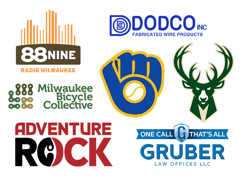
88Nine Radio Milwaukee
This locally geared radio station plays a mix of indie music, deep cuts and B-sides, and peppers in the occasionally common standard. They also do a lot of work to support the local scenes in Milwaukee.
![]()
As a station that focuses on music for the city, it makes sense that its logo combines these elements, as well. The equalizer bands also come together to form an abstract skyline.
Now go forth and impress your friends with your keen eye and pattern-recognizing abilities, then hone your eagle eye and get back to me with other hidden images I’ve overlooked.
Jason McDowell grew up in central Iowa and moved to Milwaukee in 2000 to attend the Milwaukee Institute of Art and Design.
In 2006 he began working with OnMilwaukee as an advertising designer, but has since taken on a variety of rolls as the Creative Director, tackling all kinds of design problems, from digital to print, advertising to branding, icons to programming.
In 2016 he picked up the 414 Digital Star of the Year award.
Most other times he can be found racing bicycles, playing board games, or petting dogs.

