

In lieu of announcing a No. 1 draft pick last Wednesday, the Bucks unveiled something that will probably get a lot more attention than second-round selection David Noel, at least initially: a new logo!
By now, all Bucks fans have seen the red and green version of an angry-looking Bango staring out at friends and foes alike. Since it's basically the same logo with a new color scheme, opinions have ranged from slightly good (at least they lost the purple) to rather bad (in red and green, Bango now looks like a Christmas elf).
But such are the hazards of brand identity in the sports world. In this day and age, there's not much logo continuity -- think the Green Bay Packers, Chicago Bears, Detroit Tigers, New York Yankees, etc. And the more a team fiddles with a logo in pursuit of merchandise sales, the more likely they are to design a stinker every now and again.
That reality is reflected in the historical designs amid Wisconsin sporting logos. And experimentation is not limited to the pro ranks, as any Marquette University alumni knows. In all, our local sporting logo crop is pretty strong, with some lousy ones tossed in every decade or so for good measure. The best and worst follow.
The Best
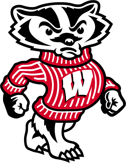 1. Bucky Badger: I can just hear all the MU grads bemoaning this one, but my top selection is not meant to be controversial. Frankly, it's tough to argue with the strident, timeless nature of Bucky Badger. He's confident, well-attired (you can't beat red on black fur), well-groomed (note the impeccable claw length) and has the posture of a determined winner. The phrase, "Blank 'em Bucky!" simply rolls off one's tongue while glimpsing this particular Badger.
In the Big 10, I think only the Iowa Hawkeye is even remotely as interesting as Bucky, and perhaps the Michigan State Spartan deserves a mention for his burliness. Michigan might have cool football helmets, but its actual Wolverine logo is far from intimidating. And what is the deal with the Ohio State Buckeye? An entire season of Brent Musberger's blather couldn't explain that one to me.
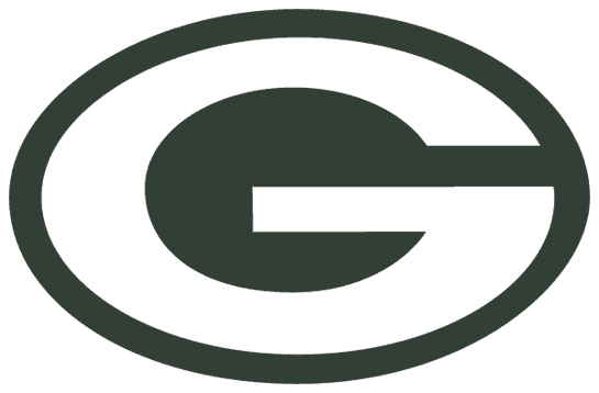 2. Green Bay Packers: At No. 2, a choice we can all agree on: the classic "G" of the Green Bay Packers. Beautiful in its stark simplicity, this green and white logo has symbolized the team since the early 1960s. Imagine that thing on an all-yellow helmet, and you can practically smell the brats and see the long lines for the parking lot port-a-potty. Or is it the other way around?
Why not No. 1? It's a fair question. If you ranked this No. 1 in your own personal list of Wisconsin sports logos, I wouldn't quibble. But to me, the only thing it lacks is personification. Bucky isn't a person, per se, but he feels like something an opponent has to contend with, not just a symbol. But ask me in October and I might feel differently (assuming Ahman Green is fully healthy).
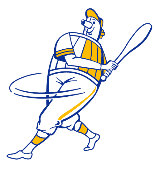 3. Beer Barrel Man: Recently, there's been quite a debate about whether or not the Brewers should return to a previous logo. I think they should, but it's not the Ball and Glove I crave -- it's Beer Barrel Man, the standard bearer of the Crew for much of the 1970s. How great is this guy? It's a man made out of a beer barrel swinging a bat. Think about that for one second. Is there a more perfect embodiment of team, nickname and city than Beer Barrel Man?
Is he a tad portly? I'll grant you that, but look at the bat speed this guy is generating. He could be a right-handed John Kruk. What's up with the nose? Not sure, but that might he his tap. When I look at this logo, I think of Gorman Thomas slamming into an outfield wall and then slamming down a few Schlitz in the clubhouse afterwards. And as a Brewers fan, there are a lot worse things a logo could conjure than that.
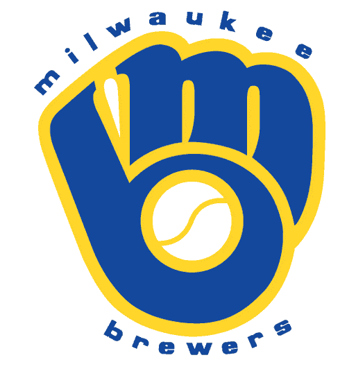 4. Ball and Glove/MB: OK, here it is: the Ball and Glove/MB logo which the Brewers made famous throughout the 1980s. This insignia is back with a vengeance, both on the field for Sunday games at Miller Park, and in sporting apparel outlets across the city. For clever design, it rates right up there with Beer Barrel Man, perhaps trumping him with its inclusion of the team's initials. Ranking it fourth is not meant to degrade it; it's sort of like saying the White Sox are only the second-best team in the A.L. Central right now. True enough, but damn good nonetheless.
 5. Spinning Ball Buck: I admit to some romanticism here. On the face of it, the Bango with the spinning basketball isn't a great logo, and it even hearkens back to some of the cheesier '70s fare that permeated the American Basketball Association. For instance, what's up with the high school glee club sweater? But this logo witnessed a championship in Milwaukee and also a string of great teams under Don Nelson in the 1980s. It brings to mind Brian Winters and Sidney Moncrief, Marques Johnson and the 11,052-seats in the old MECCA. Basically, this logo benefits from its era.
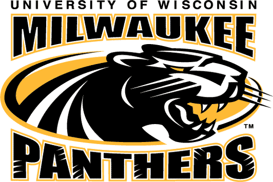
Honorable Mention: In the interests of space, I'll quickly surmise my next five favorites below. In order: Milwaukee Admirals (retired), UWM Panthers, Admirals (current), Brewers (current) and Marquette Golden Eagles (early 2000s).

|
|

|

|

|
|
I was never much of a minor league hockey guy, but both the retired and current version of the Admirals logo are well done. And there's something about that short seaman on skates that I particularly enjoy. Now that the UWM men's hoops team has emerged, so has the school's logo. I like the current Brew Crew insignia -- it's clean, has a classic feel and is far from embarrassing; it's just not as good as the previous ones. And MU's logo from before the whole "gold" fiasco is not bad, either; I'm lukewarm on it because I'm lukewarm on the nickname. It is an intimidating looking bird, though.
The Worst
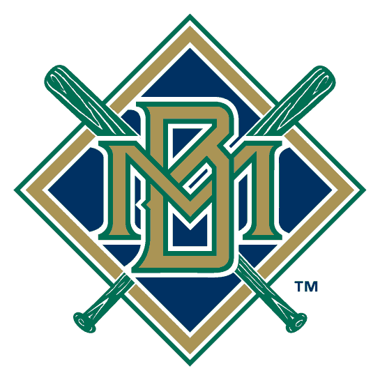 1. Mid-'90s Brewers: The Law of Associativity isn't just a math property -- it goes for logos and their teams, too, as we've already seen. And this diamond/bat thing is associated with some truly lousy Brewers clubs. Of course, this 1990s logo (it reigned from 1994-'99) was bad in its own right. The colors are terrible, especially coming off the popularity of the blue-and-yellow ball and glove. When I look at this thing, I think of Jerry Royster. OK, so Royster didn't manage the team until 2002; they were made for each other, regardless.
 2. Original Milwaukee Braves: Warning -- if you think John Bolton is perfect for the U.N. or that CBS News is ruining America, you may not like this choice, as it's a tad PC. But looking at this one today, it's fairly ridiculous that it ever made it past the conception stage. I'm imagining the following scene at a Milwaukee-area design firm in the early '50s -- Art Director to his boss: "How about this? It's an old, haggard-looking Native American whose skin is redder than a tomato." Creative Director: "I like it! Now let's go have a scotch in my office and then duck out early for lunch. Grace! Hold my calls!"
 3. 1990s Bucks: It's no wonder that the Bucks finally changed it, but it is strange that it took them so long. Why on earth did they go with purple? Was a seventh-grade girl with a crush on her home-room teacher in charge of the early design mockups?
Little-known fact about this version: if you zoom in to about 500 percent on the "U" in Bucks, you can actually see the faint outline of Todd Day missing a 22-foot jumper.
 4. Milwaukee Braves (1957-'66): I must admit, part of me looks at this logo and thinks "Now that's a classic." But that's just because I grew up with its memory and the similar design of the old Cleveland Indians logo. It makes me think of 1978 Topps baseball cards, for whatever reason. But that set stopped appreciating in value around 1989, as did the wisdom that led to this design. Even Atlanta abandoned this one by 1990. The whooping laugh/war cry/cough of the Brave in question probably cemented its demise.
 5. Marquette Warriors: I can hear the angry comments as I write this. But remember, the fifth-worst logo is just one away from Honorable Mention on the best list. This doesn't raise some of the PC concerns that other Native American logos have (a previous version, where a cartoonish Native American swiped a tomahawk across the word "Warriors," was much worse). It's just not that amazing, though it does have a certain dignity to it. One can imagine that our Warrior has just skinned whatever it is on his head and is taking a moment to relax by watching the NCAA Tournament selection show, which may explain the profile (the 9 seed in the San Diego subregional explains the glum look).
Now, if we were rating uniforms, those classic '70s versions that Al McGuire took to a National Championship (with the team name printed just above the waist rather than across the chest) would rank near the top of any list. Of course, that's another article entirely.
Thanks to sportslogos.net for providing most of these logos.
Sports shots columnist Tim Gutowski was born in a hospital in West Allis and his sporting heart never really left. He grew up in a tiny town 30 miles west of the city named Genesee and was in attendance at County Stadium the day the Brewers clinched the 1981 second-half AL East crown. I bet you can't say that.
Though Tim moved away from Wisconsin (to Iowa and eventually the suburbs of Chicago) as a 10-year-old, he eventually found his way back to Milwaukee. He remembers fondly the pre-Web days of listenting to static-filled Brewers games on AM 620 and crying after repeated Bears' victories over the Packers.