

The Milwaukee Bucks appear to be gearing up to announce a new logo change, and started the process, rather awkwardly, on April Fools’ Day. First the stadium was lit up with Blaze orange (as a joke) and then the apparent new logo (which was not a joke) was sprayed on the pavement outside the stadium. It's important to remember that the official release date is April 13th and most of this is based on what has leaked out so far, so we may see some changes in the pipes.
Anyway, how does the new logo stack up with what we’ve seen in the past?
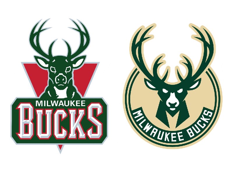
First of all, compared to the old logo, this is a huge step in the right direction, but we’re still talking in steps, not leaps.
The Deer
The old logo featured a literal representation of a straight on portrait of a dead-eyed deer with zero personality. No action and no energy, just a deer that was eating in the field one day, then heard a noise and popped it’s head up to see what's up. Then it probably went back to eating grass. Thinking more abstractly, it almost looks like my benign, lazy beagle waiting patiently to get pet. It’s just not exciting. And really, kind of pathetic.
What we believe is the new deer logo still features a straight on portrait of an unmoving deer, but this time it has angry eyes and giant, stylized antlers.
So at least now we have a logo with some purpose. This is something we can work with.
But it doesn't progress much further than that.
Basketball is a game that involves quick moves, clever tactics, and constant energy, but there is nothing dynamic about this logo. The whole thing is mirrored from right to left. There is nothing interesting about that. I want this deer to be doing something. Not running or fighting or playing basketball, but something as simple as turning its head would tell me it’s a three-dimensional living, breathing, exciting team.
Right now it says "we move from one side of the court to the other."
The design aesthetic switches back and forth between straight lines with hard angles and flowing curves, which can be dynamic, but there doesn’t seem to be any geometric consistency and most of that dynamic remains quarantined. The face is angular while the antlers are curved. The face is stylized while the antlers are rendered too literally. The ears are the only place where I can see a marriage between the two.
Moving on, the font choice is not problematic on its own, but setting it at such a steep curve is. Due to the shape of of the letters, you really have to watch for the way the I, L,W, A, and U interact with each other. In this case, they mostly don’t. Again we see separation between lines and curves. I want them to work together like a team.
The logo hides some clever elements. The smaller set of antlers is reminiscent of a basketball and the neck of the deer hides the a new M logo…er…sorta.
The M
![]()
That M logo. Some have suggested this new letterform is reminiscent of a deer’s hoof print, but if this was the goal (which I like), it hasn’t been met. I’m seeing more of a Boba Fett or Magneto (though, to their credit, they are beloved anti-heroes, which makes for good storytelling).
The simplicity of it is nice, too. It has a more recognizable shape than an upside down triangle. It’s easier for kids to draw, too (don’t underestimate this).
I want to like this new M, but it’s hard to decide if I do because from what I can tell they haven’t settled on a final design. There are currently 3 versions and it looks like they’re leaning towards the wrong version.
The M’s that were sprayed outside the Bradley Center have distinctly different proportions than the ones included in the promotional video, which are even more distinctly different from the M in the deer’s neck.
The sprayed M’s are a little more squat and better proportioned and the terminals of the M have room to breathe.
The M from the video is taller, almost as if they took the sprayed M and squished it horizontally. Thankfully, after much fiddling with Photoshop this doesn’t appear to actually have been the case, but it’s still not good that it FEELS this way. The terminals end much closer together, which is visually uncomfortable. Throw on a stroke (as all sports teams are wont to do) and the video M is confined and strangled.
Moving on the M in the deer’s neck ALSO features completely different proportions. Not a great start to brand identity.
(For what it’s worth, I appreciate the sprayed version the most).
The Colors
The team colors have also changed, but the green is staying the same. Cream was chosen for the Cream City brick (mkay) but we’ll have to wait and see how this looks on the players’ uniforms. Cream comes uncomfortably close to the Caucasian skin tone. I come from the cycling world, and I’ve seen this become problematic in the past.
![]()
The 2011 cycling kits from Footon-Servetto
![]()
2015 Columbian Women’s National Cycling Team
Apparently the Bucks have also chosen a blue to represent the lakes (mmmmmkaaaaay), but it doesn’t seem to have surfaced in the promotional material so far.
The final word
So in the end, it’s a real mixed bag. This IS an improvement on what we had before. If I were given a t-shirt, I would wear it. It's just…
But ultimately this analysis, and the design changes in general, may be an exercise in pointlessness. Teams don’t sell tickets and merchandise with design and mascots. They make money with wins. Teams that do well will sell merchandise by the boatloads. Teams that don’t won’t. Design changes may help to capitalize on the eventual nostalgia, but the only way that’ll matter is if they can produce the results worth remembering.
Jason McDowell grew up in central Iowa and moved to Milwaukee in 2000 to attend the Milwaukee Institute of Art and Design.
In 2006 he began working with OnMilwaukee as an advertising designer, but has since taken on a variety of rolls as the Creative Director, tackling all kinds of design problems, from digital to print, advertising to branding, icons to programming.
In 2016 he picked up the 414 Digital Star of the Year award.
Most other times he can be found racing bicycles, playing board games, or petting dogs.


