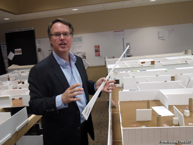
How does one pull thousands of works of art off the gallery walls, plus remove thousands more pieces from storage and then figure out how to put it all back again in new gallery space?
That’s the question the Milwaukee Art Museum’s curatorial staff faces as the 1950s Eero Saarinen and 1970s David Kahler building are being not only renovated, but in the latter case, also expanded.
As the museum’s Jim DeYoung coordinated the de-installation of the collection, chief curator Brady Roberts and his team have been occupied with the work of putting it all back together when the renovation is completed later this year. (The galleries are expected to reopen to the public in November.)
How have they gone about answering the question?
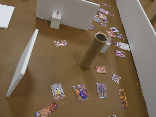
Have exhibition designer David Russick construct a detailed scale model of every inch of the new gallery spaces – which were designed with HGA – and print out tiny reproductions of the art and get to work.
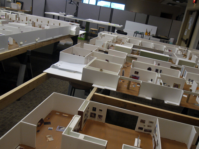
"When we started this process five years ago, just conceptually thinking about what the opportunities were, we decided we would just wipe the slate clean and think about all our collection areas and what the logical location for each collection area would be," Roberts tells me as we begin an in-depth tour of the sprawling table-top models that occupy a goodly portion of the museum staff’s temporary offices in the O’Donnell Park transit center building.
In addition to Roberts and Russick, the curatorial team includes Tanya Paul, The Isabel & Alfred Bader Curator of European Art; Brandon Ruud, Constance & Dudley J. Godfrey, Jr. Curator of American Art & Decorative Arts; Lisa Sutcliffe, Curator of Photography & Media Arts; Monica Obniski, Demmer Curator of 20th & 21st Century Design; and Margaret Andera, Adjunct Curator.
The result of these efforts will be a correction of sorts. While changes over the years have led to a sometimes disjointed or less than perfect arrangement in the maze-like galleries, now, more light-sensitive photography galleries will be on the lower level, and contemporary art, which contains many monumental works, will be upstairs where there at 17-foot ceilings.
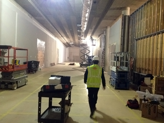
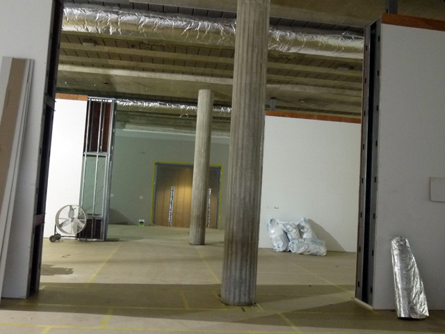
"Every floor plan is developed around the needs of the curator and the collection," says Roberts, noting that in some areas, the buildings thick support columns will be hidden within walls and in other areas they will be exposed.
"It’s actually a pretty ideal space. Once David built this model, we were looking at it saying, ‘You know, if we were building a new space for contemporary art, it would pretty much look just like this.’ By and large it’s a really functional space. You just have to work with the different ceiling heights. If you look at the building, it’s not too hard to figure out what should go where.
"It only took us a couple years to figure out," Roberts adds with a laugh.
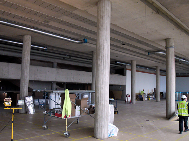
In addition to improving connections, like putting the Herzfeld Center for Photography and Video Arts adjacent to the photography galleries, changes to the wall configurations in the Bradley Collection – which will mostly remain in place – should improve lighting contrasts.
And an adjacent outdoor space, long locked off to visitors, will be opened as a sculpture garden.
A second changing exhibitions gallery will complement the Baker/Rowland Galleries in the Quadracci Pavilion, which means that MAM can overlap major exhibitions.
In addition, the consolidation of a number of existing storage and back of house spaces has opened up considerably more room for the museum to show off its collection.
On the first floor, facing the lake, a long narrow space will lead to a coffee shop that will offer views of the Calatrava-designed building and Lake Michigan. The 90-foot hallway will be part of the cafe, with seating for patrons.
An entrance will also be added to the east facade.
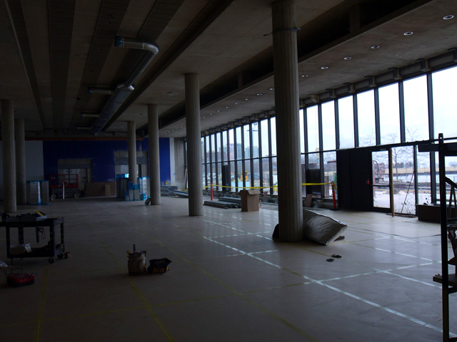
"We know from observation that a lot of people, in the summer when they’re walking the path, they try to get in," says Roberts. "People who remember where the old door is will walk up. I see them do it even during the winter. There’s interest in entering the museum right there so I think with this being so inviting, a lot of people will just come in and check it out."
What’s interesting about the models is that while some mini galleries – such as one housing works from the Layton collection – are neat and orderly, others have tiny works strewn everywhere.
Roberts chuckles when I point that out.
"You should’ve seen it before," he says. "Every curator works differently. The photography curator had about a thousand photos just strewn about on the floor. We were like, ‘Wow, did she quit?’"
I asked if curators were able to quickly buy into a grander vision or if they jockeyed for the most "prime" spaces in the new galleries.
"Every curator developed their check list of things they’d want to include in their reinstallation," says Roberts. "We really tried to think holistically and fairly for everyone."
One of the most impressive aspects of the new design is the intuitive wayfinding, which helps reduce the need for signage.
"(That was) one of the keys to this project," says Roberts, "because our floor plan was very maze-like before. We’ve created a system of enfilades, which are these major hallways."
One such sightline leads directly to the museum’s famous Francisco de Zurbarán painting, "Saint Francis of Assisi in his Tomb."
"You could stand in 21st century design and say, ‘You know, I really like the European old masters’ and be like, ‘Oh, there’s the Zurbarán.’ Without even reading a sign or looking at a map, you understand where you’re going. Along the way, you’ll see this – Duane Hanson’s janitor – a signal for photo-realism lives here."

A similarly key work will be on view right inside the entrance to these galleries from the Calatrava addition.
"As soon as you enter from the Calatrava building, you’ll look down and see Tom Wessleman’s iconic pop art piece (‘Still Life #51,’ which depicts a can of Pabst Blue Ribbon). It’s Milwaukee; it’s New York. It’s global modernism. It’s a great introductory piece.
"We love that kind of clarity, openness and transparency and indications of what’s to come."
Walking into the gallery space from the Calatrava building, you’re faced with three soaring galleries that feel open and impressive, in stark contrast to the claustrophobia that often enveloped visitors stepping into galleries in these buildings before.
These galleries will house modern and contemporary works.
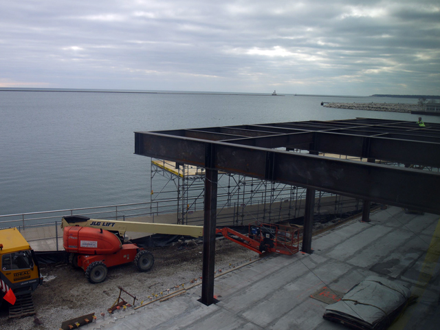
"These are really big spaces and since we took the grid down and we knocked down the maze, we kept these north and south walls," says Roberts. "What happened is that it opened up the building in every direction. We looked at it and thought, ‘Wow, we have a huge volume of space here and it’s perfect for the scale of this art. If you look at the proportion of the art to the space, it’s ideal."
On paper, and in the tiny galleries that Russick built, the new galleries at Milwaukee Art Museum appear to hold the promise of better flow, better organization, expanded space to display works from the collection and more appropriate – and less oppressive spaces – for viewing the varying styles of art included in the museum’s collection.

"We feel really good about this," says Roberts after we head across to the museum to stroll though the actual spaces depicted in the model. "David, working with HGA, came up with this really great floor plan where every collection is shown to its best advantage.
"Having said that, the museum is a dynamic place and it’s growing and we have curators who are buying great works of art. It won’t last us forever. We feel like we’re building a floor plan that should work for future generations. Time will tell if we’re right."
To see an earlier update on the museum's construction project click here.
Born in Brooklyn, N.Y., where he lived until he was 17, Bobby received his BA-Mass Communications from UWM in 1989 and has lived in Walker's Point, Bay View, Enderis Park, South Milwaukee and on the East Side.
He has published three non-fiction books in Italy – including one about an event in Milwaukee history, which was published in the U.S. in autumn 2010. Four more books, all about Milwaukee, have been published by The History Press.
With his most recent band, The Yell Leaders, Bobby released four LPs and had a songs featured in episodes of TV's "Party of Five" and "Dawson's Creek," and films in Japan, South America and the U.S. The Yell Leaders were named the best unsigned band in their region by VH-1 as part of its Rock Across America 1998 Tour. Most recently, the band contributed tracks to a UK vinyl/CD tribute to the Redskins and collaborated on a track with Italian novelist Enrico Remmert.
He's produced three installments of the "OMCD" series of local music compilations for OnMilwaukee.com and in 2007 produced a CD of Italian music and poetry.
In 2005, he was awarded the City of Asti's (Italy) Journalism Prize for his work focusing on that area. He has also won awards from the Milwaukee Press Club.
He has be heard on 88Nine Radio Milwaukee talking about his "Urban Spelunking" series of stories, in that station's most popular podcast.

