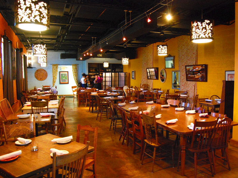
"We ended up in Walker's Point because I always loved Walker's Point," Sandroni says enthusiastically. "Zur Krone was one of my favorite bars. I like that it's a mixed cultural neighborhood. It's a very old, industrial, architecturally cool area."
As it turns out, it was a great fit and it wasn't long before La Merenda's reputation for exquisitely prepared international tapas made it a popular dining destination. Milwaukeeans quickly fell in love with the restaurant, but despite its continued success, Sandroni felt it was time for a little remodeling.
He tapped local restaurant designer Katie Harding to makeover both the interior and exterior of the building at 125 E. National Ave. during a brief hiatus earlier this summer.
Like many new restaurateurs, Sandroni says money was tight during his first few months of operation and he couldn't afford proper lighting to complement the mellow, stylish vibe he'd envisioned for the space.
Now that the restaurant is stable, he decided to upgrade much more than the lights, resulting in a classy, cohesive new look for La Merenda.
Designer Harding detailed the changes for us, describing the renovations as providing a unique guest experience: a passport to wander the world soaking up its flavors, images and colors, and stirring them into an eclectic global design stew.
To begin, she painted the restaurant's front door and glass block window framing chrome yellow and dark red, giving it the pop it needed to stand out on a rather dark stretch of road. The foyer area now provides a cheery welcome with granny smith apple green walls and Aegean blue ceiling, contrasted by black and white framed photos.
The Aegean blue opens up an "infinity wall" at the rear of the dining room, suggesting the sea and sky of the exotic locales that inspired the restaurant's concept. And a newly-created "map room" in the bar area features a world map mural with postcards from around the globe, framed pages from a vintage geography textbook and ancient world map prints. A new bar rail has been installed for guest convenience, and a black and cream botanical rug further defines the area.
"Everything I added is evocative of international climates, be it Mexico or China or 1st and National in Milwaukee, which complements (Sandroni's) menu concept," says Harding.
New lighting throughout the restaurant is designed in a black and cream theme as a striking contrast to the bright wall colors. Black metal leaf chandeliers featuring a nature inspired design and lined with ivory linen shades glow in the dining room, hostess area and map room. The olive branch and fern patterns evoke the organic ingredients favored by Sandroni. Black basket weave column lamps reflect the tropical climes featured in several menu items. Charcoal and ivory pendant lights were installed over the bar, creating a sophisticated and intimate atmosphere.
Black and natural diamond hard pleat bamboo window treatments also provide a counterpoint to the bold color scheme and reference the menu's global influences. Black and cream shoji screens separate the server's stations from the dining room, also taking a cue from the new color palette and the exotic world theme.
"We think that the overall look has given the place just a bit more trendy look to it," says Sandroni. "We know that we still have some hard tones to the restaurant -- concrete floor and walls, to just name a few -- and wanted to lighten up the space a bit with softer lighting and new colors. I think that we achieved that; plus it's always nice to make some aesthetic changes. We've been looking at the same stuff for almost four years, it was time for a change."
OnMilwaukee.com staff writer Julie Lawrence grew up in Wauwatosa and has lived her whole life in the Milwaukee area.
As any “word nerd” can attest, you never know when inspiration will strike, so from a very early age Julie has rarely been seen sans pen and little notebook. At the University of Wisconsin-Milwaukee it seemed only natural that she major in journalism. When OnMilwaukee.com offered her an avenue to combine her writing and the city she knows and loves in late 2004, she knew it was meant to be. Around the office, she answers to a plethora of nicknames, including “Lar,” (short for “Larry,” which is short for “Lawrence”) as well as the mysteriously-sourced “Bill Murray.”


