This month, we visit our neighbor to the south for a series of weekly Racine Spelunking stories in which our Bobby Tanzilo explores some Racine County gems.
Tour even a few Frank Lloyd Wright properties and you’ll notice a recurring theme – beyond the recurring architectural and philosophical themes of Wright’s work – that of Wright’s penchant for intractability, for stubbornness, for – one way or another – getting his way.
But, often, his little spats with clients led to works of stunning beauty.
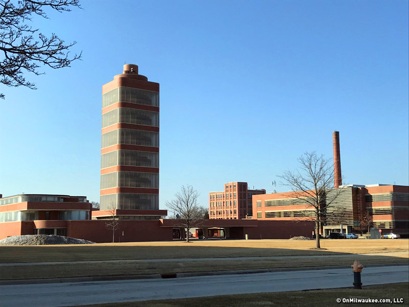
Take, for example, the windowless administration building and research tower at SC Johnson (aka Johnson Wax), 1525 Howe St. in the heart of Racine.
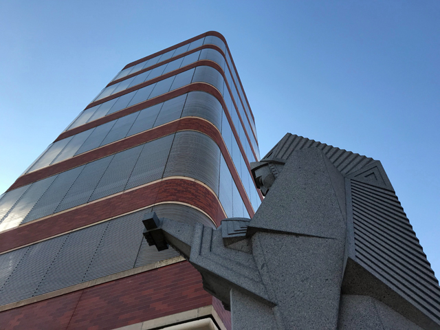
The buildings – put up in 1936 and 1947, respectively – are unrivaled architectural treasures in the state. They – along with Sir Norman Foster’s Fortaleza Hall – are not only a testament to the Racine company’s forward-looking philosophy, the admin building and research tower look the way they do in part because of Wright’s opposition to their location.
Wright, whose work embraced nature, pushed Herbert Johnson Jr. – who began running the family business after his father’s death in 1928 – to relocate the company outside the city, where its windows would overlook natural surroundings.
But Johnson was committed to Racine and refused. This led Wright to design a building with no windows. Instead, a skylight and other openings were filled with rows of long Pyrex tubes, affixed to one another with mastic (which, incidentally, proved prone to leakage and was later replaced).
(NOTE: Wright also designed the Wingspread residence for Johnson in nearby Wind Point in 1937.)
The result is a light-filled building (and tower) that offers absolutely no views of the landscape outside.
According to Kristin Visser, author of "Frank Lloyd Wright & the Prairie School in Wisconsin: An Architectural Touring Guide," the admin building is an adaptation of a building drawn for an earlier project.
"A local architect drew up plans for a typical Beaux Arts building, which company officers rejected as uninspired," Visser wrote. "Wright, whose career had been moribund since the mid-1920s, was suggested by one of the company’s public relations consultants, who was familiar with Wright’s work.
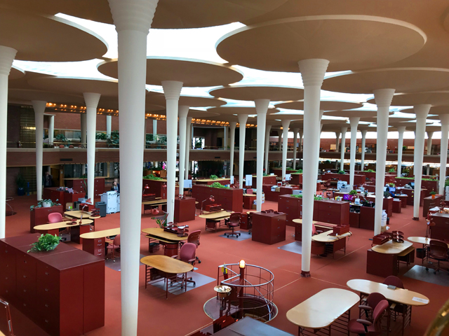
"Wright showed the Johnson officials drawings he had made five years earlier for a proposed newspaper plant in Salem, Oregon. The main room of the newspaper plant was two stories high, supported by mushroom-shaped columns that tapered from top to bottom. Mezzanine offices overlooked the printing presses on the ground floor. Johnson officials were impressed. Here was a design that would make the kind of statement about originality and creativity that the company wanted."
And that reads like a pretty good description of the building that Johnson Wax got, albeit at four times the $200,000 cost that Wright estimated.

When you arrive for a tour, you begin at the Golden Rondelle, a sort of golden spaceship that serves as the visitors’ center. Not a Wright work, the Rondelle theater was drawn instead by Lippincott and Margulies as a pavilion at the 1964 World’s Fair in New York and was later moved to Racine.
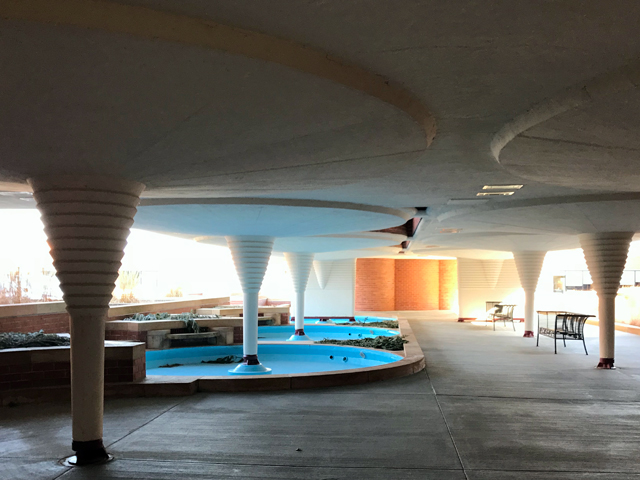
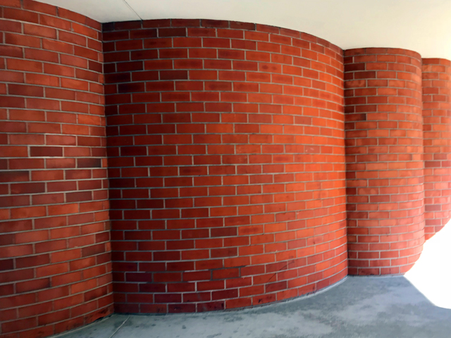
From there, you pass the sleek, square tower – with its soft, rounded corners and alternating bands of Cherokee red bricks and 17 miles of Pyrex tubes – and head through the low-ceilinged area with a series of reflecting pools – which reminded me a lot of similar spaces at Wright’s Florida Southern campus – before reaching the main entrance.
As you step through the door, you’re greeting by a soaring atrium.
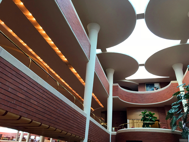
As my tour guide Markist Booker pointed out, Wright loved to use this device of a low space opening into a tall one, to further emphasize height. In this case we also move from the relative darkness of the exterior area to the stunning lightness of the atrium – with the same amplifying effect.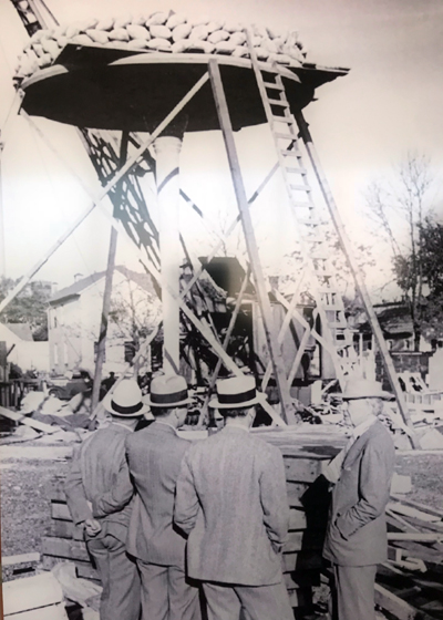
Almost barely registering on the exterior – because of the route by which it is approached – inside, the administration building is almost unspeakably beautiful and your eyes hardly know where to look first.
Those columns – here referred to as "dendriform," the shape of trees, rather than as mushroom-shaped – are the most striking element in the Great Workroom. While you may see them as a forest of support columns, tapering elegantly toward the top – where they support a flat portion 13 feet across – to me they look even more like lily pads, and we’re at the bottom of the pond looking up, the skylights above acting as the surface of the water.
Johnson couldn't get the required permits to build the administration until Wright could prove that the columns would support 12 tons each. Holding a high-profile test, Wright erected a test column and put 12 tons of sandbags on top. Then he added 12 tons more. Then another 12, and another 12 and, finally, another 12, showing that the columns could, in fact, bear 60 tons each.
Johnson got his approvals to move forward.
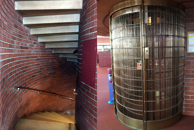
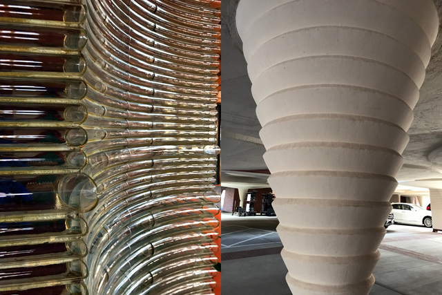
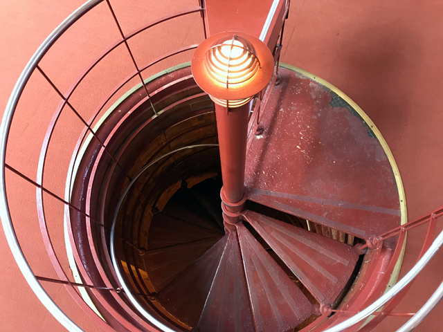
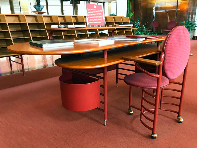
There is a brass, columnar caged elevator, staircases that swirl up to the mezzanine (where you get the best view of the vast expanse of the Great Workroom), the almost ship-like spiral staircases down to the ladies’ lounge on the lower level, the skylights that take on a diamond-like shape between the columns, the stunning (if not altogether stable) chairs and desks Wright designed for this room, that atrium laced with greenery, the 43 miles of Pyrex tubes (especially in the arched connecting bridge), the Kasota stone trim, the Cherokee red brick used throughout ... this is a remarkable space and you wish you worked here.
I asked SC Johnson Community Affairs Manager Amy Winter if the 500-600 people who work on the campus appreciate these buildings.
"They do," she said. "I think it's a great source of inspiration for employees. And that was the goal of Frank Lloyd Wright was to sort of work his vision alive, and create a source of inspiration for our SCJ people but also our visitors from around the world.
"It was described to me on my first day that it was sort of like working in a museum."
And yet, Wright was so far ahead of his time that these buildings are the kind of collaborative spaces that many companies even now haven’t quite learned to build.
"Frank Lloyd Wright really had a focus on creating open, comfortable, collaborative communication space," Winter said.
"You can see that in the administration building with the concept that was created before his time of open collaboration and communication. The same in the research tower, with the alternating mezzanine levels that create that communication between the scientists and R&D at the time."
After spending some time in the administration building, we walk over to the tower, which reopened for tours a few years ago after having been closed to everyone for many years because, with a single means of egress, it did not meet fire code.
Now, tours climb up to see one of the floors and the mezzanine above it. What you see on those two floors is simply repeated as the cantilevered tower rises.
Much like a modern-day skyscraper, the tower (which also went way over budget, costing double the $2 million estimate by the time it was completed in 1950) is built around a central core (pictured just below) with an elevator and staircase.
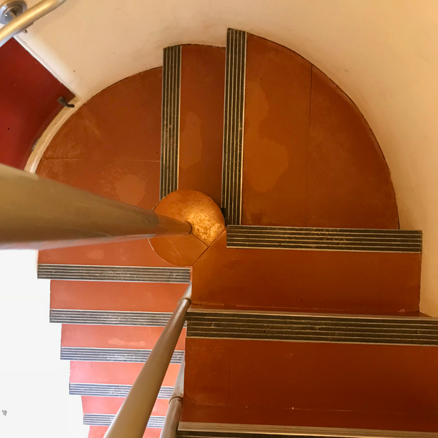
Climbing the spiral staircase, you notice that Wright put restrooms on the tight landings and they almost look like the head on a ship. Even the mirror above the sink follows the curve of the exterior wall, which creates something of a sideshow effect.
The labs wrap around the central core and above each of the eight full floors is a mezzanine level to allow communication – verbal, though not visual – over the side of the mezzanine, the floor of which does not reach all the way to the exterior wall.
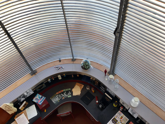
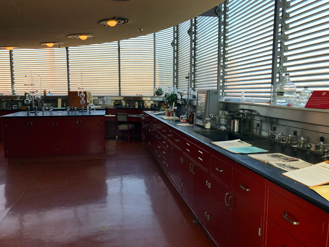
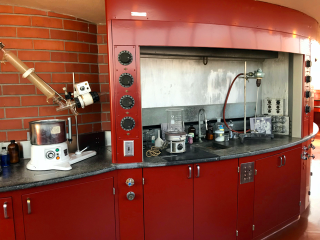
And those exterior walls in the labs are basically lab counter-to-ceiling Pyrex tubes again. The result is that the tower is absolutely flooded with light, especially the south-facing side. So much so that lab workers asked for shades after moving into the tower. Though the window coverings idea was nixed, workers were provided with glasses.
Afterward, we get to use the tunnel system, some of which dates to the Wright era, but most of it coming later. Some of the tunnels are entirely covered, while other sections are capped with arched skylights.
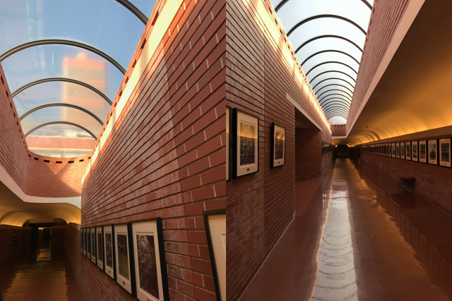
This latter set offers a route to Fortaleza Hall, which opened in 2010 and was designed by Sir Norman Foster. The building pays tribute to H.F. Johnson’s 1935 flight to find carnauba wax in Brazil and his son’s recreation of that trip. The plane from Sam Johnson’s trip hangs in the building’s atrium.
Here, on the lower level, there is a gallery with changing exhibitions that focus on Wright’s work.
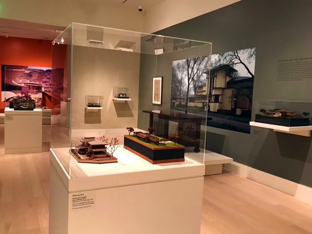
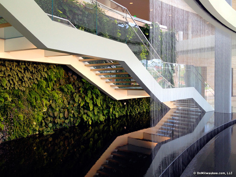
Of course, Foster’s glass and stone building is in itself notable and worth exploration. Inside there is a garden wall, which brings a much-needed dose of greenery – just like Wright added to the administration building on the other end of the tunnel – as well as that dangling plane, a series of amenities for employees, the gallery, another gallery detailing the history of the company and a stunning marble floor that includes an inlaid map of the Johnsons’ Brazil journeys using four types of sustainably harvested wood and also reflects interesting views of the building above.
Hiring Foster, to me, is a sign of a company that still chooses not to play it safe when it comes to architecture. Having two stunning Wright structures on the campus might lead some folks to hire Taliesen to design a third Prairie Style building. But, instead, SC Johnson sought another pioneer.
"That's very reflective of SC Johnson's philosophy," Winter said. "Forward-thinking, before our time, so that has always been in sort of our company values, as well as the architecture, so I think that's why these buildings are still such a great symbol of what SC Johnson stands for as far as forward-thinking. I know Markist talked earlier about fiscal, equipment and ingredient transparency, sustainability, the environment ... we've continued that trend through all five generations, and that continues today.
"These buildings stand as a symbol of that."
Click here for information on free SC Johnson campus tours.
Born in Brooklyn, N.Y., where he lived until he was 17, Bobby received his BA-Mass Communications from UWM in 1989 and has lived in Walker's Point, Bay View, Enderis Park, South Milwaukee and on the East Side.
He has published three non-fiction books in Italy – including one about an event in Milwaukee history, which was published in the U.S. in autumn 2010. Four more books, all about Milwaukee, have been published by The History Press.
With his most recent band, The Yell Leaders, Bobby released four LPs and had a songs featured in episodes of TV's "Party of Five" and "Dawson's Creek," and films in Japan, South America and the U.S. The Yell Leaders were named the best unsigned band in their region by VH-1 as part of its Rock Across America 1998 Tour. Most recently, the band contributed tracks to a UK vinyl/CD tribute to the Redskins and collaborated on a track with Italian novelist Enrico Remmert.
He's produced three installments of the "OMCD" series of local music compilations for OnMilwaukee.com and in 2007 produced a CD of Italian music and poetry.
In 2005, he was awarded the City of Asti's (Italy) Journalism Prize for his work focusing on that area. He has also won awards from the Milwaukee Press Club.
He has be heard on 88Nine Radio Milwaukee talking about his "Urban Spelunking" series of stories, in that station's most popular podcast.

