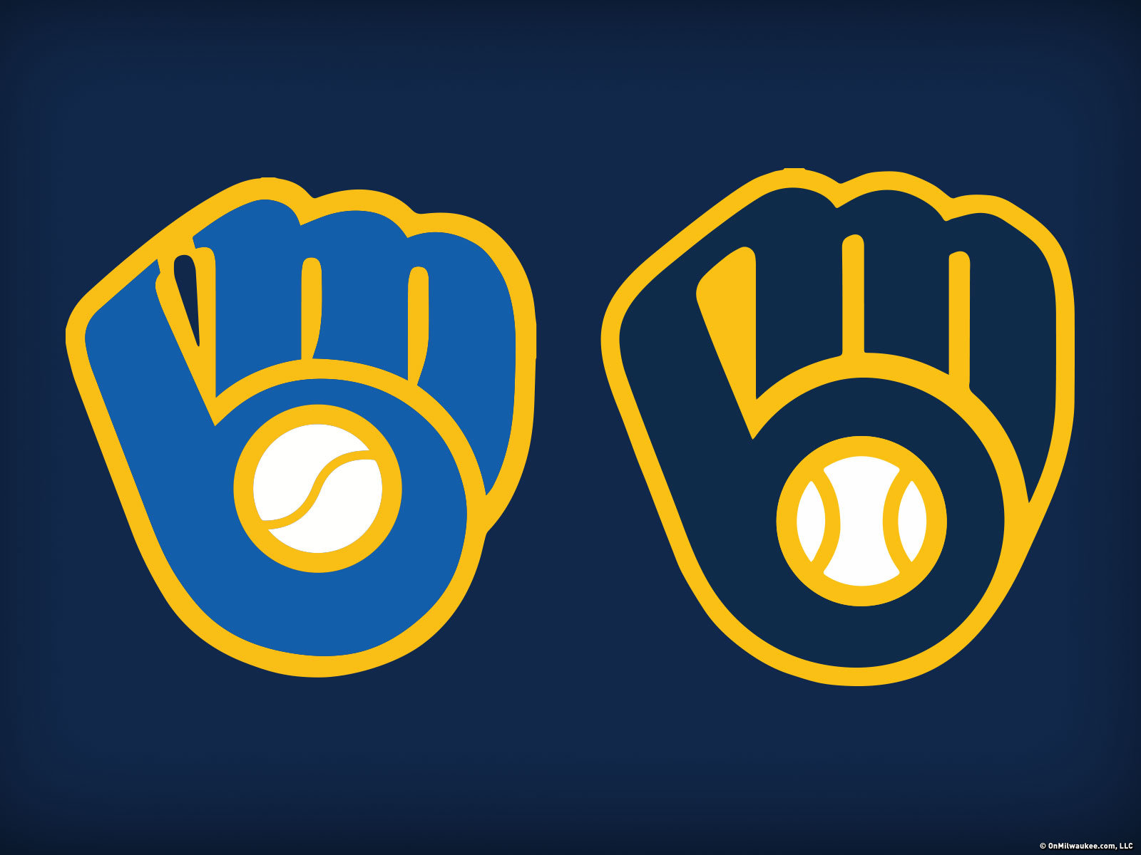
The Milwaukee Brewers released a new logo and set of icons last night, and the results are sure to please those who hate change. The team chose to revert to and evolve the classic "ball and glove" logo, originally designed by Tom Meindel in 1977.
The new retro logo, refined by Rodney Richardson at RARE Design, may seem to be minimally changed at first glance, but the freshly tuned geometry adds significant stability to the classic mark.
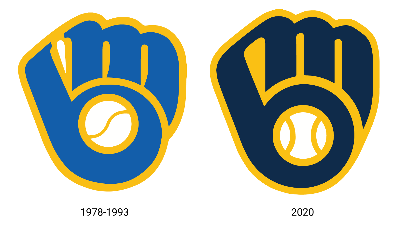
The blue is now a more royal hue, which allows the grain yellow to sparkle against the darker backdrop. The glove was made a little less wide, and the legs of the M stand a little straighter. The mesh between the thumb and forefingers was simplified. The circles radiating from palm of the glove to the ball were also re-aligned, which was desperately needed. The changes in total work together to balance the icon and reduce the overall wonkiness of the original.
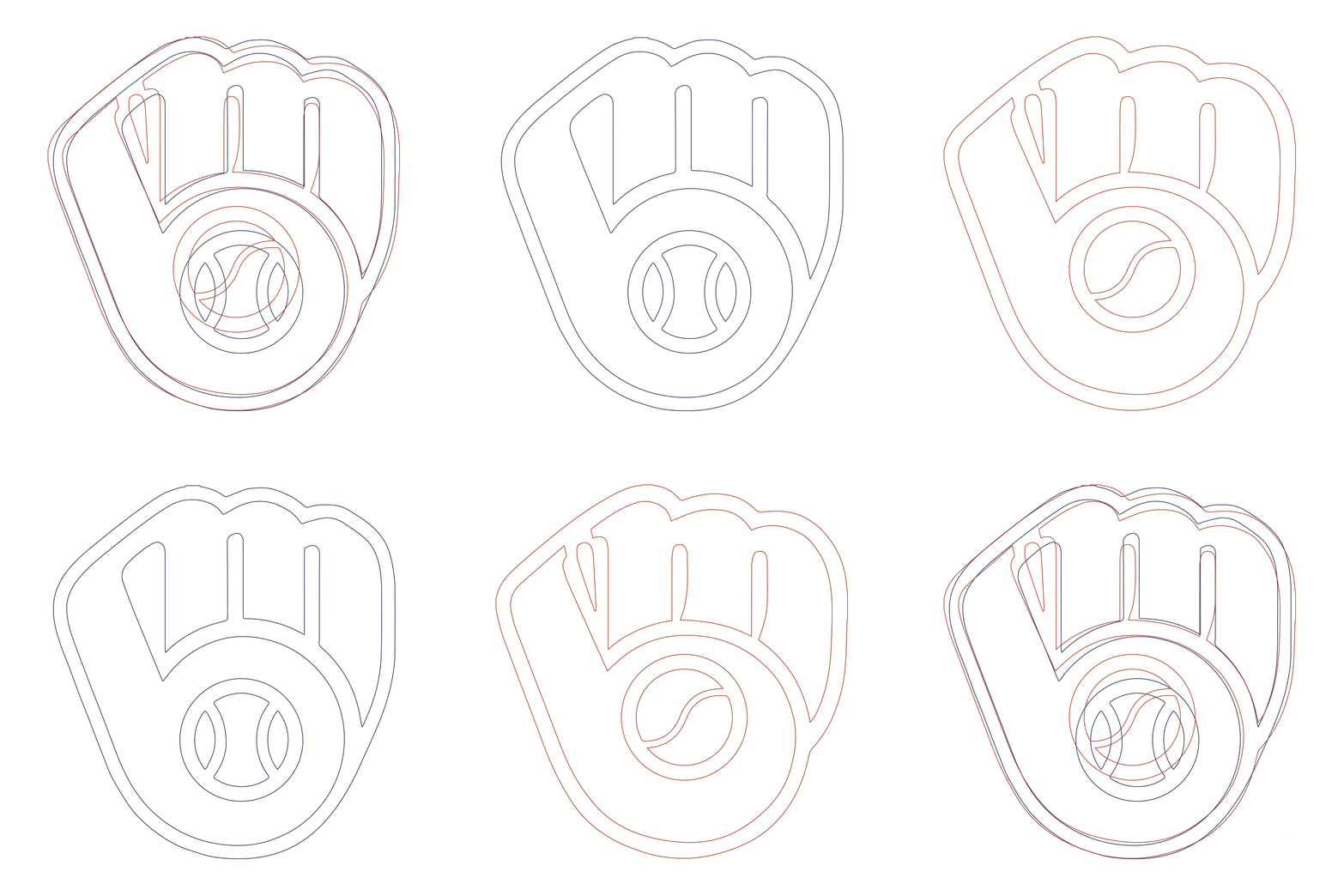
The seams of the baseball have also been rendered more accurately and symmetrically, though consequently more generically. It's almost a shame they didn't lean into the weird S-curve seam of the original as another "ownable" icon, but I can forgive them thanks to the inclusion of the grain ball icon (which I love) in the secondary icon set.
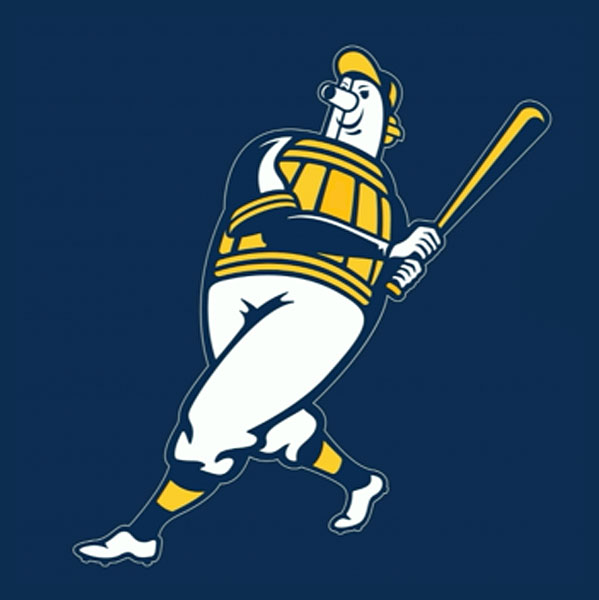


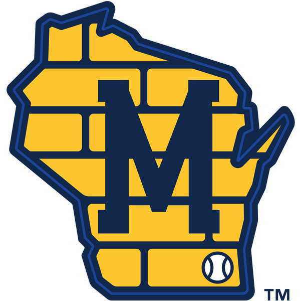
Of the five icons, the M-state icon is the weakest because it forces a lot of elements together without gaining cohesiveness. Where simplification is the name of the game through most of the set, this one seems to take an opposite tack. I'm not sure the brick pattern is necessary, and the placement of the ball closer to Kenosha is a little bothersome.
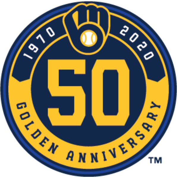
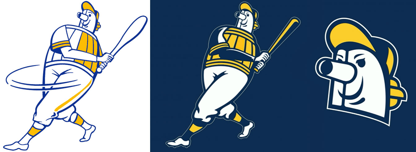
The other icons include a limited edition 50th anniversary patch, an updated Beer Barrel Man — which was redeveloped to work better on dark backgrounds (instead of merely being recolored) and whose visage gained about 20 percent more 'tude — and that aforementioned grain ball, which is so simple and effective.
The icon is accompanied by a new typeface, though at this point I am unsure if it's something custom or a pre-existing selection. Nevertheless, it is a condensed, sturdy, slabby, half-serif, upper-case with all curves hammered straight. It looks classic with a hint of uniqueness on the uniforms, but in other applications, the smaller the letters get, the chunkier they feel. It's not super elegant, but it feels distinct and maybe adds back in some of that wonk we lost in the newly finessed logo.
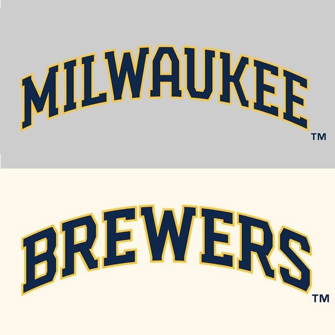
This font is paired with a somewhat strange sibling, in which curves are re-introduced into the letterforms to create a hybrid, half-hammered script. It currently appears on their road alternate jersey.
Speaking strictly on letterforms, the letters that spell out our city's name lend themselves well to a script aesthetic, with its alternating highs and lows and swooping Ws, Us and Es. Other companies, such as Milwaukee Tool or the Milwaukee Bicycle Company, have proven the concept and the Brewers' new entry brings good company.
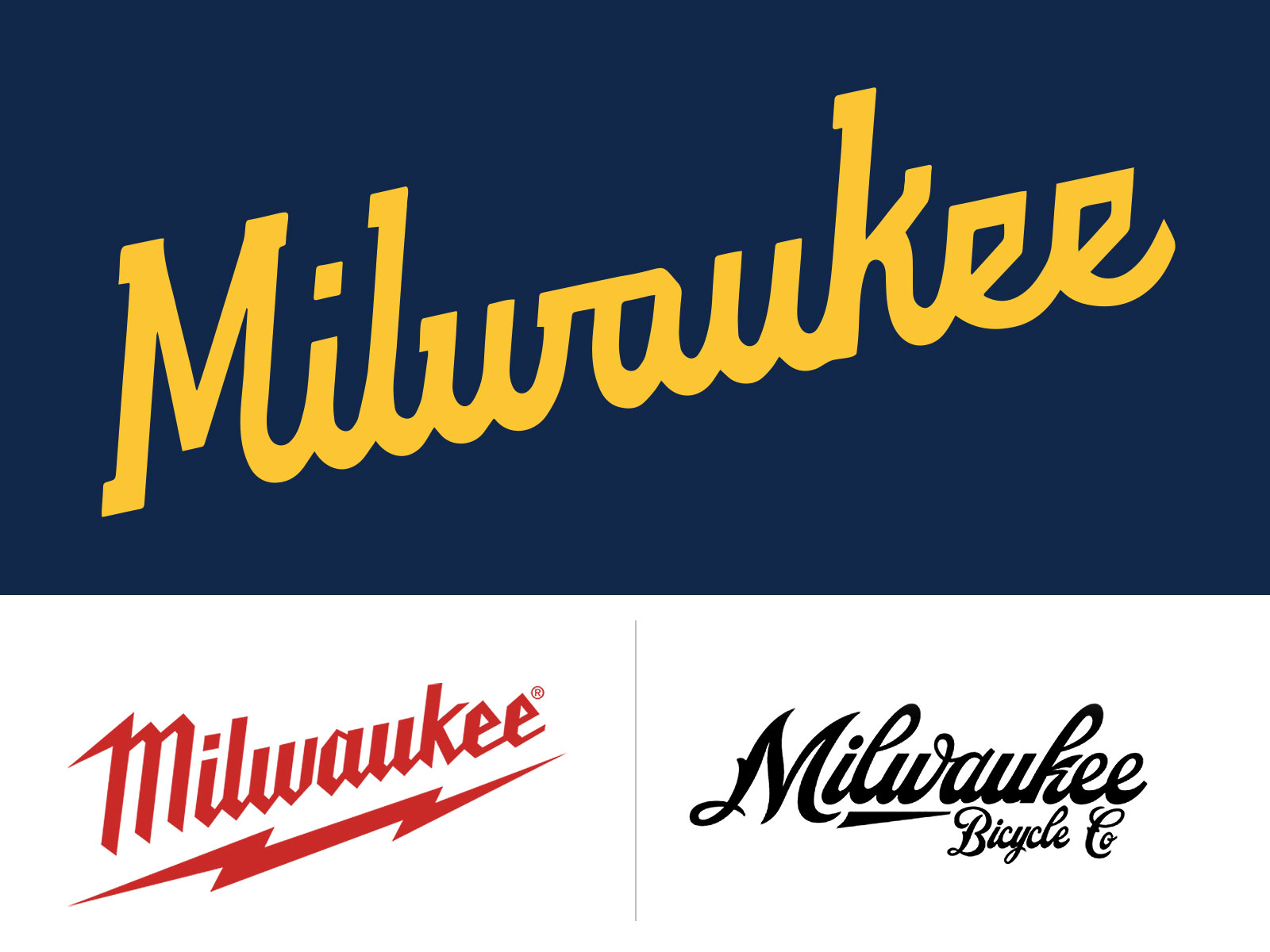
Again, the letterforms are not as elegant because they lack any real line-weight variation, but it does nevertheless feel more own-able, especially compared to the old Brewers script logo, which never felt exciting or distinct.
Interestingly, though it was never explicitly stated, the hybrid script, with its straight lines on top and curvy waves on the bottom, does remind me of an abstract rendering of the city skyline on the lake. If this was intentional (there is not enough information to know for sure, but I doubt it) it's quite clever.
Overall this is a satisfying new set of icons. It doesn't come out of left field, and while it doesn't quite knock it out of the park, it is an exciting evolution that takes me back (to the ballgame).
Jason McDowell grew up in central Iowa and moved to Milwaukee in 2000 to attend the Milwaukee Institute of Art and Design.
In 2006 he began working with OnMilwaukee as an advertising designer, but has since taken on a variety of rolls as the Creative Director, tackling all kinds of design problems, from digital to print, advertising to branding, icons to programming.
In 2016 he picked up the 414 Digital Star of the Year award.
Most other times he can be found racing bicycles, playing board games, or petting dogs.

