


The Milwaukee Bucks released the design of their new City Edition uniform that, according to a press release, was "inspired by the bold colors of their renowned MECCA era which represented Milwaukee to the world and defined a generation of success."
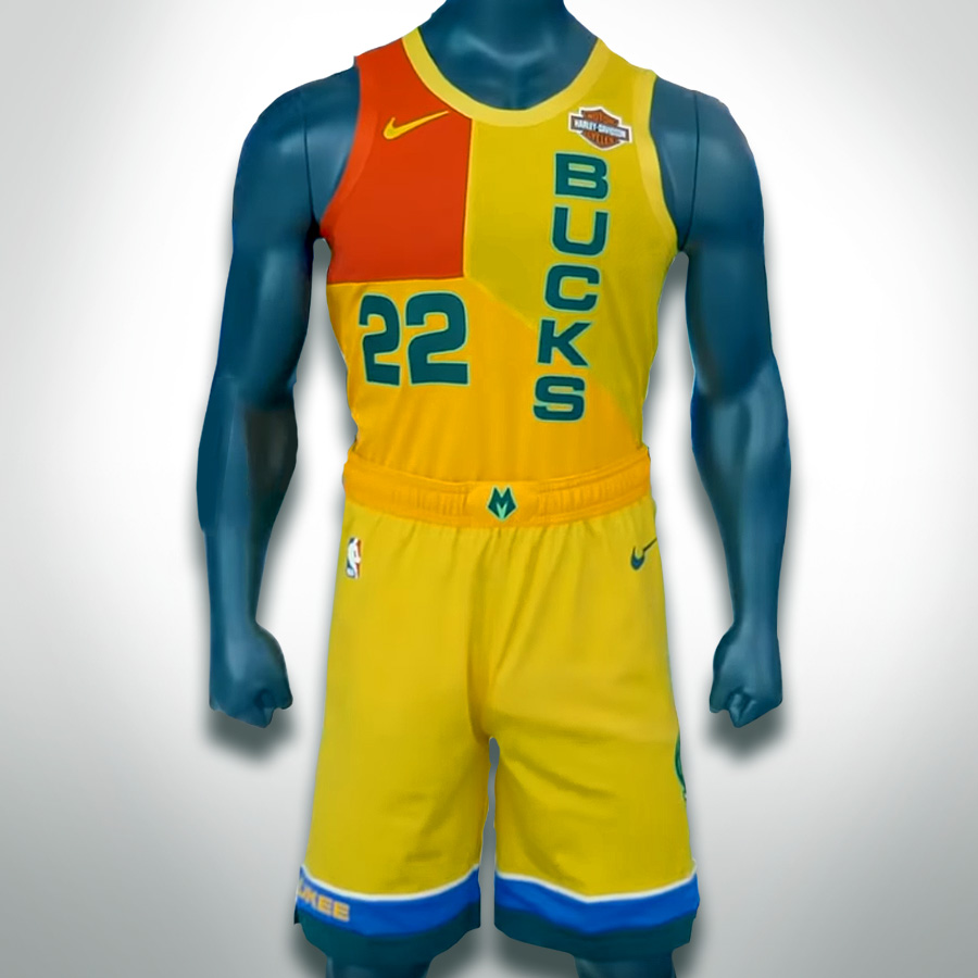
Bold indeed. The new uniform designs are primarily a bright yellow, with a square of red across the left pectoral, which is then framed horizontally and vertically by green lettering and numbering. The shorts are a less exciting, but nevertheless a field of yellow, which is ringed by blue and green at the bottom.
The uniform has split reactions to the extremes, but either way a strong reaction is a good sign: you'll never get everyone on board, but it's easier to convince the haters to follow you in a new direction, because ultimately, they're showing you they care.
Just ask resident scoff-er, Matt Mueller, who is beginning to warm to the designs.
Over the years, Bucks uniforms have rarely been exciting. They're mostly white, with rings of color around the openings. And while the current green-and-cream standard does have a classic, understated cool-ness to it, this bold, new, colorful City uniform will be a classic for the exact opposite reasons. It's loud and engaging and makes a statement.
The new jerseys are striking. There is an asymmetry to them that makes them visually active. The high-contrast next to low-contrast colors gives a surprise-around-every corner feel. For instance the two flavors of yellows and greens co-existing next to each other make you wonder if you're imagining things, while every other color on top of the yellow fields screams out with excitement. It's a uniform that will take advantage of every ounce of saturation from your 4K HD AMOLED TV.
At the same time, the wackiness doesn't make the players' bodies look weird and misproportioned.
"The bright colors ... became synonymous with NBA basketball in Milwaukee during one of the franchise's most successful stretches from the late-70s through the mid-80s," the press release said.
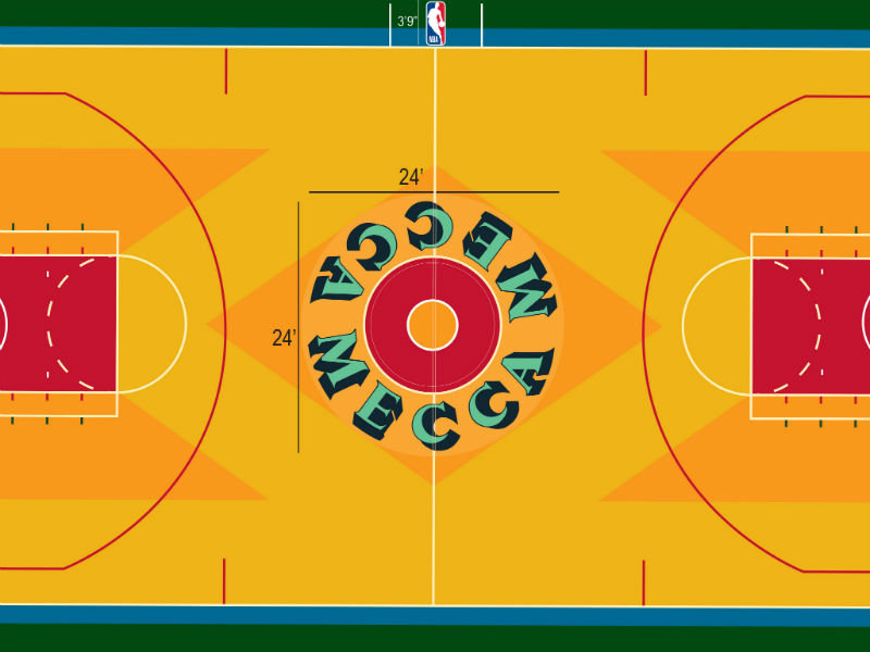
But interestingly, those colors came from the court floor.
Instead of pulling design inspiration from jerseys past, which can lead to stagnant ideas, the team fascinatingly pulled ideas from below their feet, which seems like something of a strange place to pull inspiration from. Upon the initial leak, Chris Creamer of sportslogos.net suggested, "We’ve seen courts designed to match elements from a uniform, I’m not sure we’ve ever seen it the other way around." (In basketball, anyway. Portland's airport carpet has seen a bit of love in this direction.)
But the MECCA floor, designed by Robert Indiana, has long made our hearts flutter. And now, after donning a jersey, the two can be closer than ever.
So this uniform has a lot of duties to attend to: It has to hearken back to a previous era and tap into our nostalgia, but still has to kick out the corners of the current brand and mark the entrance of a new era, perhaps one that is more flexible and creative, one with more possibilities. At the same time it also has to make Milwaukee basketball look good.
It is organized chaos, and that's exactly what you want to see in a basketball game.
And what better time to grab our attention, when Wisconsin is perhaps enjoying its mathematical peak in sports performance these days.
Despite the heavy lifting, all things considered, the uniform actually keeps things pretty simple. The design could have been more obvious and just cos-played as the floor, but thankfully it appears the designers trust the public.
I do think the shorts are a bit of a disappointment. Its not a deal-breaker, but wonder why all the action was kept to the top of the uniform. At the time of the leak, Gameplan Creative, a sports design agency, rode the coat tails of the announcement with their own mocked-up vision of what the uniform could look like and I gotta say, I dig their shorts design more.
However, looking at a kit on the hanger is far different than seeing it in action. Once it's actually on a body, moving across the court, everything changes. Ultimately I think this is a real winner. It's more exciting, inspiring, entertaining and collectible.
And really, when it comes down to it, they're no more ridiculous than the Green Bay Packers' yellow pants, and we don't think twice about those.
Jason McDowell grew up in central Iowa and moved to Milwaukee in 2000 to attend the Milwaukee Institute of Art and Design.
In 2006 he began working with OnMilwaukee as an advertising designer, but has since taken on a variety of rolls as the Creative Director, tackling all kinds of design problems, from digital to print, advertising to branding, icons to programming.
In 2016 he picked up the 414 Digital Star of the Year award.
Most other times he can be found racing bicycles, playing board games, or petting dogs.


