

There has been a low murmur about Reno lately because when it recently unveiled a new city flag, it bore a striking resemblance to the new People's Flag of Milwaukee.
It's true. The design contains a bisected circle with some masked lines below it and (very generally speaking) the flags are similarly colored with a hue of yellow and a couple of hues of blue. But the Reno flag also features a mountain and a star. Similar, sure, but also quite different.
This is the curse of "designs so generic and interchangeable that at a passing glance you could mistake the flag of Reno," claims Evan Rytlewski of the Shepherd Express.
So let's take a look at a couple of designs that are even more generic than these two flags.
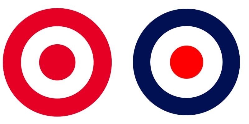
Both the Target logo and The Mod icon (famously adopted by The Who) are a Russian stacking doll of three circles, and the primary difference between the two is that the largest circle is blue instead of red.
Now show these two logos to anybody on the street and ask them what each icon represents. The symbols could hardly be more similar, but their influence and the way we understand them could hardly be more different. One represents a hipster-safe global super market giant complete with polo shirts and khaki pants, and the other icon recalls loud British superstars, smashed guitars, knee-high boots and mop tops.
The recognition and differentiation is instantaneous.
Last weekend Jeff Rosenstock, an 18-ish-year punk veteran, took the stage at the Back Room of Colectivo while wearing a simple white muscle shirt with one of these two logos. Can you guess which one?
It was the one with the blue circle, duh, because he is a punk rocker! If he came into view wearing a shirt with the red circle he would have sent a completely different message.
All conveyed with the shift of one color.
So here's the hard truth that Civic Flag proponents don't get: It largely doesn't matter what symbols adorn the banner. It could be stars, stripes, horseshoes, clovers or blue moons; more than 1,000 flag designs were initially submitted for consideration and any one of them could have represented our city in a similar way.
What does matter is that it inspires people to get behind it. That people dump their blood, history and equity into it. A flag is worthless if nobody flies it.
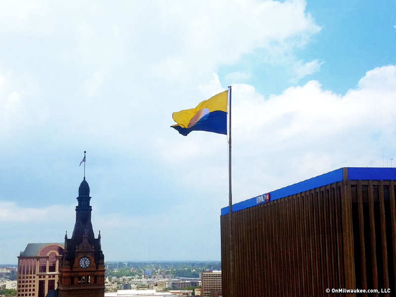
And that's the crux of the issue today: Up until The People's Flag came around, NOBODY cared about the Civic Flag. The only place it could be found was hanging limply from indoor poles inside civic institutions and flown outside the occasional Downtown Marriott. It wasn't flown anywhere else. Most people were unaware that we even had a flag. The Civic Flag failed because it isn't a simple, elegant and versatile system. Nobody knew how to use it. It was too complicated to implement widely. It's "horrid" and "polluted" like a certain Nevada city. And now it's too late to turn back.
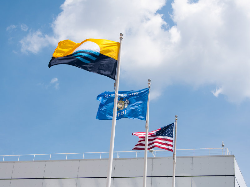
We chose a new design with a clearer vision. And since its inception – despite city officials dragging their feet on adopting the new design – the People's Flag has been widely embraced by the citizens of Milwaukee.
Even against the rise of a handful of Civic Flag wavers, more People's Flags are being flown outside residences, more logos, uniforms, bicycles and fliers have been derived from it, and more local businesses have themed their wares around it. OnMilwaukee made stickers that riffed on it and those stickers disappeared in a whirlwind. (Keep your eye out, we're printing more.) It took two years for the People's Flag to do what the Civic Flag never could in nearly 70.
So at this point it doesn't matter what the People's Flag looks like, it just matters that people have dumped their ideas, equity and emotion into it.
Maybe next time Rosenstock comes to Milwaukee he'll be sporting a different circle logo shirt, but one thing's for sure, it won't be Target's.
Jason McDowell grew up in central Iowa and moved to Milwaukee in 2000 to attend the Milwaukee Institute of Art and Design.
In 2006 he began working with OnMilwaukee as an advertising designer, but has since taken on a variety of rolls as the Creative Director, tackling all kinds of design problems, from digital to print, advertising to branding, icons to programming.
In 2016 he picked up the 414 Digital Star of the Year award.
Most other times he can be found racing bicycles, playing board games, or petting dogs.