
The new logos and jerseys have been revealed and, according to Charlie Larson, the vice president of communications for the Milwaukee Admirals, what follows is "an evolution of the logo. Everything is different. It's not such a stark contrast."
To me the new logo is a combination between the regalness of the old, 1997 skin-clad Admiral and the more recent 2006 bare-boned version and seems to be designed to split the difference between the desires of the fans who have been polarized by the cartoon skeleton boy. But as a result it loses some of the dynamism of both.
Personally, I don't really understand what fans are seeing when they champion the 1997 Admiral. It's pretty uninspired in design, character, and color choices. Really, it seems fans aren't actually rooting for the old and stodgy, but more about just voting out the cartoon skeleton.
If this is the case, I don't know if the new logo will make anybody any happier.
@littletinyfish both. Admirals, not pirates. Looked like it was trying to cash in on the popularity of pirates of the caribbean.
— Vince Edwards (@metalvinny) July 14, 2015
The new logo was designed by Louisville, Ky.-based Studio Simon, which has specialized in sports logo design for more than 20 years. Fascinatingly, Dan Simon revealed to me that this new skeleton is not a revamp of the original skeleton boy. It's actually his dad!
"We didn't throw out the skeleton boy with the bathwater," said Simon. "This guy does not replace the old character. This is his father. They're in the same business, but father is different than son. We built upon the old story and gave it a fresh new look."
Fans of the skeleton boy will be pleased to know that he'll be sticking around as third tier merchandising.
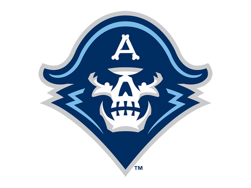
The skeleton dad logo keeps the "Lake Michigan blue," but introduces a few more naval elements, lightens the black to a friendlier navy blue and incorporates a new custom typeface and letter mark. The two previous logos had the Admiral's head turned a quarter to the left, but the new logo is a more symmetrical view. Symmetry is not a particularly exciting visual for such a dynamic sport and I had the same complaint about the new Bucks logo earlier this year, but the triangular mark itself feels very well anchored.
The intensity of the skeleton has been amped, taking a dominating perspective from below, with its head aloft as if it's about to let loose with an evil, blood-freezing cackle. The admiral-ness of the character has also been restored. Despite the presence of naval regalia of the 2006 skeleton it seemed to lack a certain prestige; the new logo now puts the lapels and epaulettes in full view.
The history of the skating sailor
Historically, the skating admiral logos seemed to bounce between casual and serious as the logo evolved. The earliest skating sailor logo was a friendly looking cartoon in an over-sized hat. In the 80's we saw our Admiral grow up, become weathered, and get serious about the game. Two decades later saw a return to something more fun when he shed his skin.
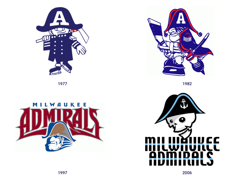 The first skating sailor logo debuted in 1977.
The original skeleton, designed by Joe Locher of The Yes Men, came into being to reach out to the demographic that appreciated skateboard art. And despite the vocal outrage upon its initial release, the team sold more merchandise in following six days than they did in the previous year. I also remember reading the origin story about how the 1997 Admiral had perished in the depths of Lake Michigan and came back as a skeleton, but that lore seems to have all been lost from the internet. (I can't help but wonder if that would have played better in today's Captain America/Avengers-franchise climate.)
From an acquisition perspective, Larson considers the 2006 skeleton boy logo to be a success. "The kids loved it. We saw people wearing it much more than we had before. 15 years ago merch was an afterthought. Now it's at the forefront of what we're doing."
Can the new logo continue to expand that fan base? One of the nice parts about sticking with a skeleton motif is that the admiral has the potential to become a more inclusive character; it doesn't have to be a white man as with earlier renditions. It doesn't have to be a dad or a boy. It could be anybody of any race or gender (It could be Admiral Michelle J. Howard, for all we know).
If the original goal of the skeleton boy was to attract new, younger fans, it could easily be adapted to attract an even more diverse fan base. Whether they do something with that remains to be seen.
![]() The full Milwaukee Admirals logo.
The full Milwaukee Admirals logo.
So what are the challenges that need to be overcome to produce a successful sports logo? "One thing that's common through all sports branding from the lowest level to the highest level is always going to be the embroidery," explained Simon. "Embroidery is imperfect. A logo better replicate well when stitched on a polo at an inch and a half."
So sports logos shoot for a simplification of shape and form. "The thinner the outline, the harder it is to embroider." Simon continued, "And when these logos are getting used on smartphone apps, the logo has to look good at that size as well. Stuff has to get used so small and still be effective."
The typeface and tertiary elements
The typeface is a step in the right direction. Again it looks like a combination between old and new. It does fall into the stereotypical extreme, angular, intense sports font, but moving from an upright, inactive, digital-inspired type to an angular, 19th-century woodcut-inspired typeface appropriately recalls the sharpness of the skate blade, the intensity of the skeleton, and the history of the sea combat. It's still a narrow type set as before, but it is much more active.
"It's a custom font we developed specifically for this identity for Admirals use only," explained Simon. "Similar to developing unique characters for the team. This font was created especially for this identity to work with the character."
Below the word mark sits a navy-like star and sabre-like swash.
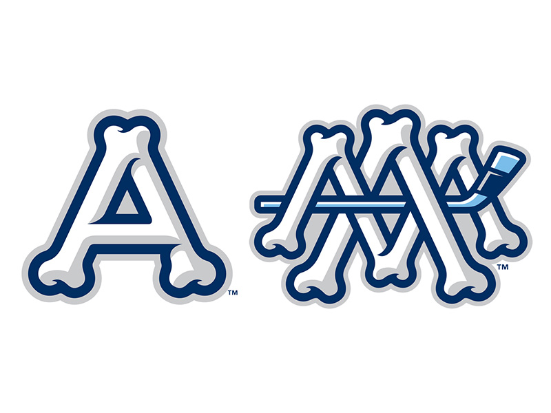 The A and MA lettermarks.
I think the A and MA letter marks, the tertiary design elements, are among the most successful part of the new vision. The A is nicely balanced, and stands out in all applications. It's totally iconic and has the potential to be totally timeless. The hockey stick in the MA ligature might be a bit cramped, but I like how fun the idea is.
However, as successful as these letter marks are, I don't like them in conjunction with the typeface. The type styles form two very different shapes that look too clunky together, especially when proper adjustment is not considered.
 Here is a comparison between what was provided to me, versus a "cleaned up" version. Even when modified, the combination of the letter mark and the typeface is clumsy at best.
The bottom line
While I think the character and type are adeptly rendered, I think it does lose a bit of its soul. The skeleton haters will be disappointed to see the skeletons, and the skaters might be disappointed to see a return to the "sports franchise aesthetic." But I don't think it's so objectionable that it would be a tough sell to either side, so I do think it will go some distance to heal the rift between the two camps.
"We've retained something that was beloved by a lot of people and we're building on the old identity," said Simon. "If it was resoundingly hated we wouldn't have sold a stitch of merch and attendance would have dropped, but attendance actually grew. Hopefully there are a lot of people that like this, too."
"We're not trying to combine the best of both worlds, but then again, I'm not saying it isn't."
Larson knows whatever the early thoughts about the new designs are now, the fans will eventually look back fondly on them. "Some people have made up their minds. It's still a skeleton, but it's evolved. The hat's on a little straighter. After a little while it grows on you and you're a fan of the team. It becomes an emotional thing.
"We're happy with where this is going."
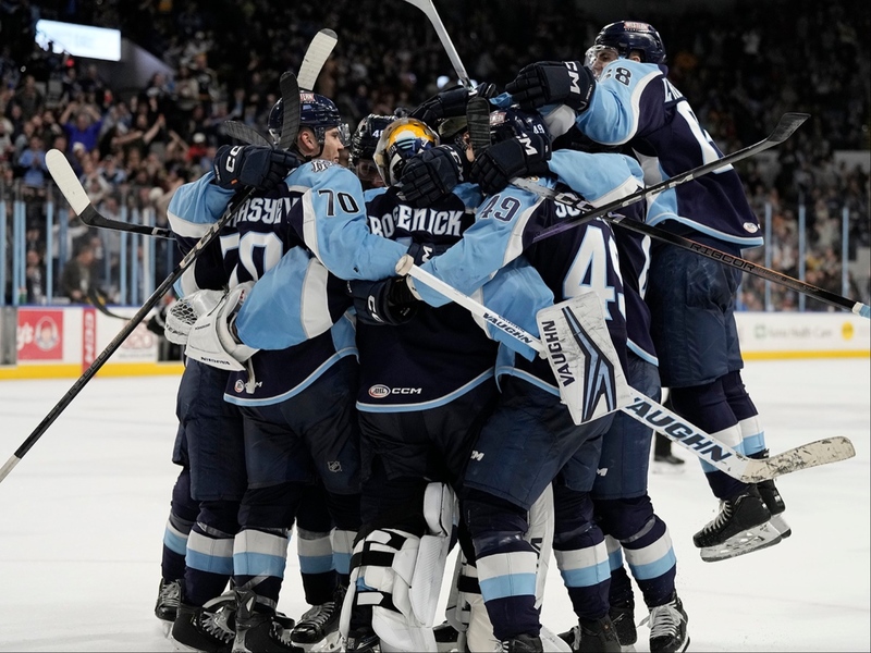
 The new Admirals jerseys.
Jason McDowell grew up in central Iowa and moved to Milwaukee in 2000 to attend the Milwaukee Institute of Art and Design.
In 2006 he began working with OnMilwaukee as an advertising designer, but has since taken on a variety of rolls as the Creative Director, tackling all kinds of design problems, from digital to print, advertising to branding, icons to programming.
In 2016 he picked up the 414 Digital Star of the Year award.
Most other times he can be found racing bicycles, playing board games, or petting dogs.