I've been a Samsung Galaxy user since 2016 when the S7 was released. I held onto it until my case-less abuses began separating the back from the main body and I took a tumble down the white sand dunes in New Mexico. I could never quite get the device clean of gypsum after that.
Currently I'm happy with the Galaxy S9, or at least I was, until U.S. Cellular handed me the brand new Galaxy Note 10+ to take for a spin.
After giving the device back, I find myself thinking about all the advanced features I'm now missing.
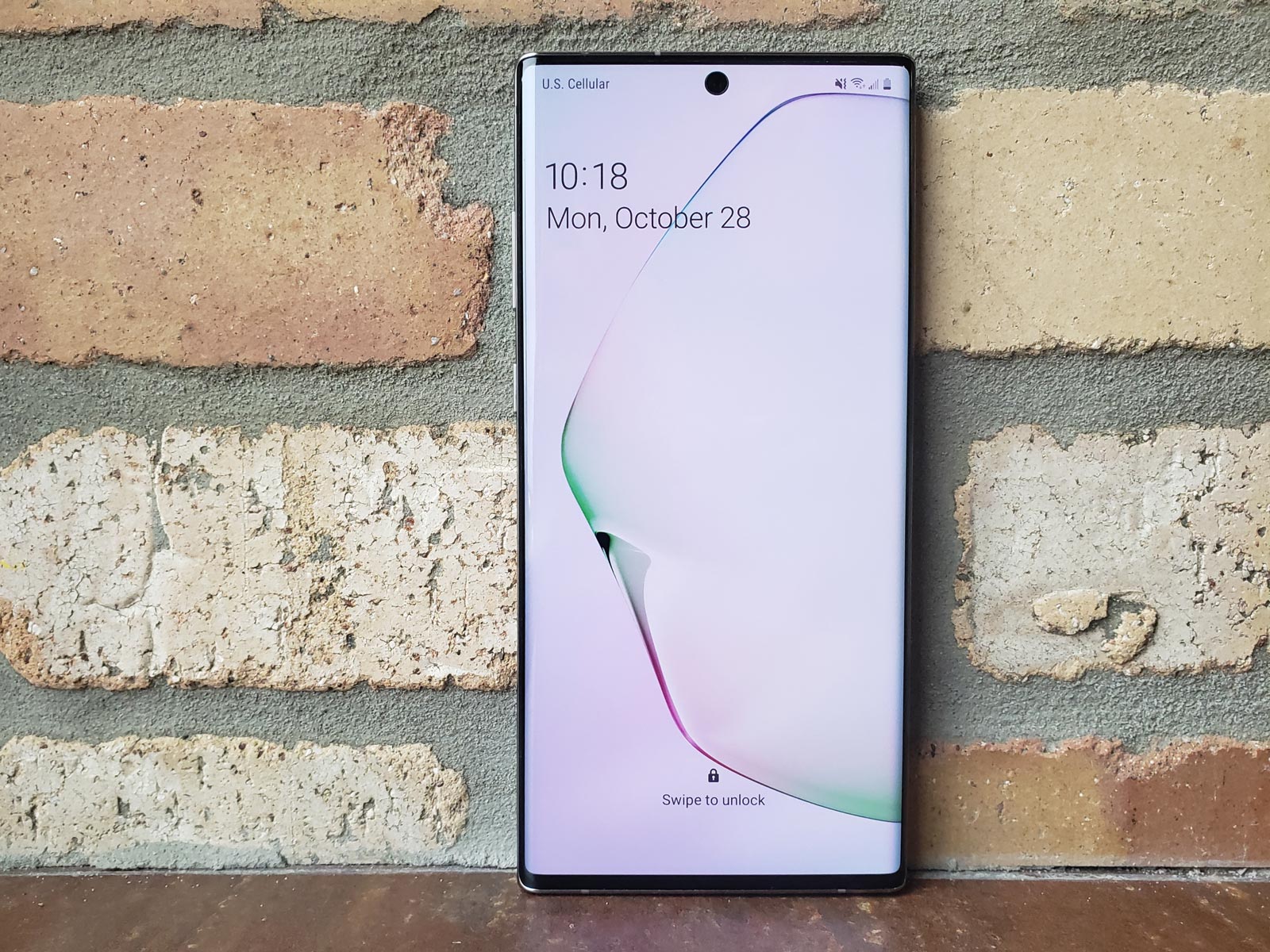
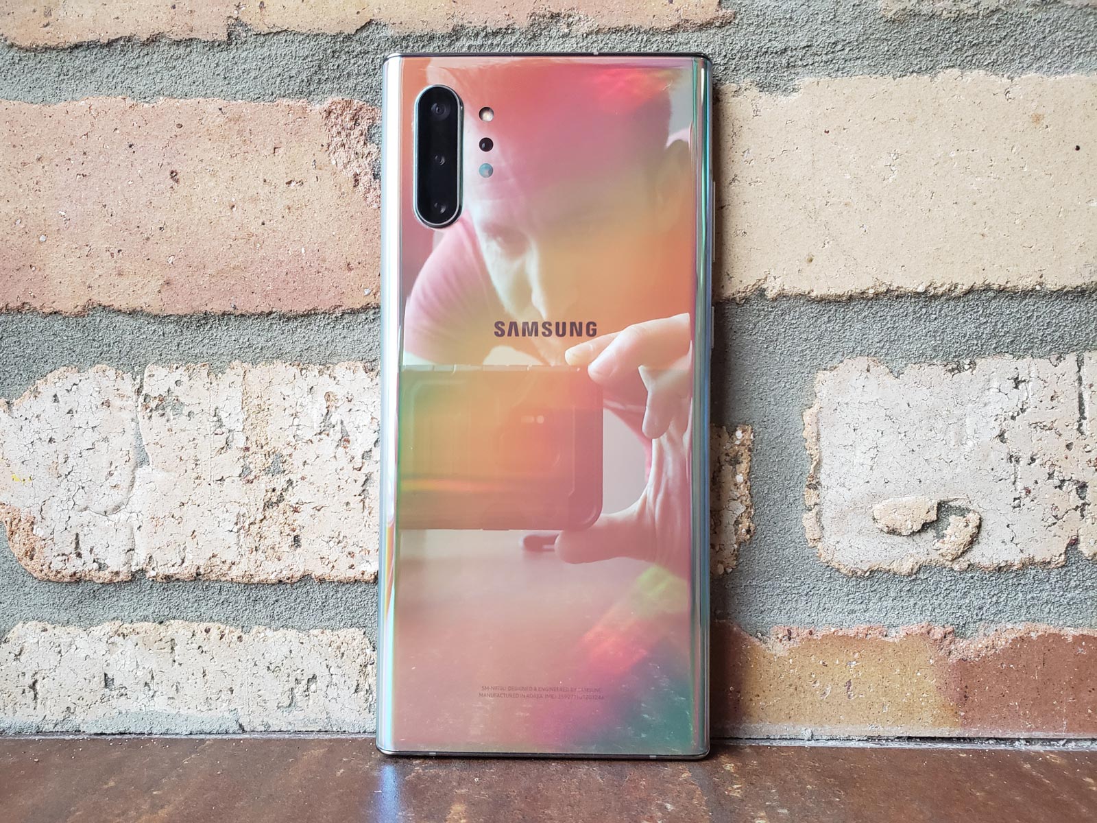
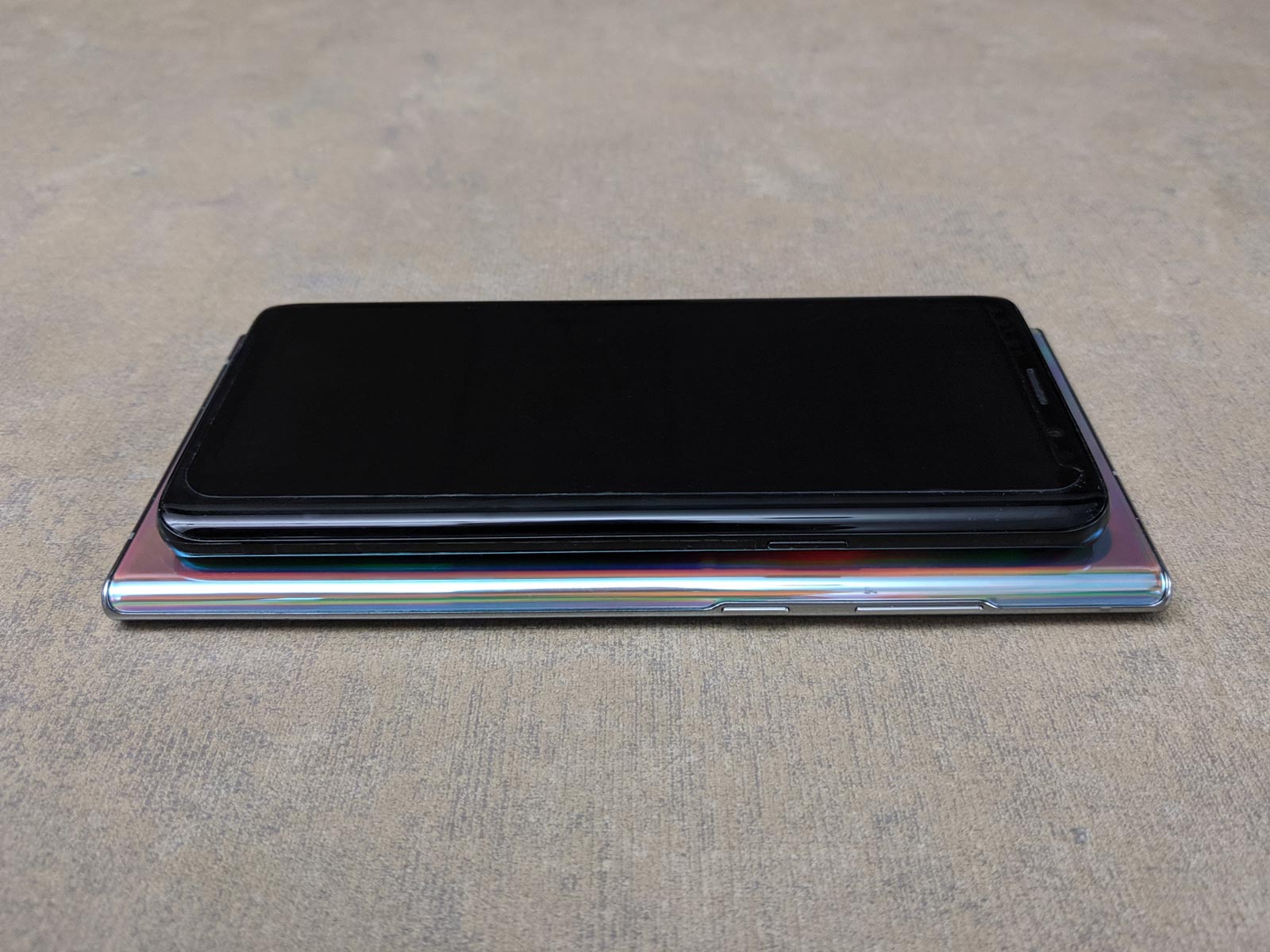
Overall, it's a bigger device, providing a lot more screen real estate and room for a much bigger (and longer lasting) battery. The "oil-slick" coating on the back certainly is a fresh look when you pull it out of the box, but having learned my lesson with the white sands, its appeal is fleeting since it'll likely be wrapped in a case for most of its life. On the plus side, a case will be helpful in disguising the little bit of lateral flex that I can feel in the buttons; that little wiggle cheapens the feel of an otherwise spectacular package.
The Stylus
The Note10+ comes with a pressure-sensitive pen, which was fun to draw with. Beyond artistic endeavors, it's great for giving your fingers a bit of time off and it helps avoid a constant barrage of fingerprint smudging. However pulling it out, picking it up and setting it down is a bit unwieldy compared to just using your fingers, so it didn't come out unless I knew I was going to be sitting down with the phone for a while.
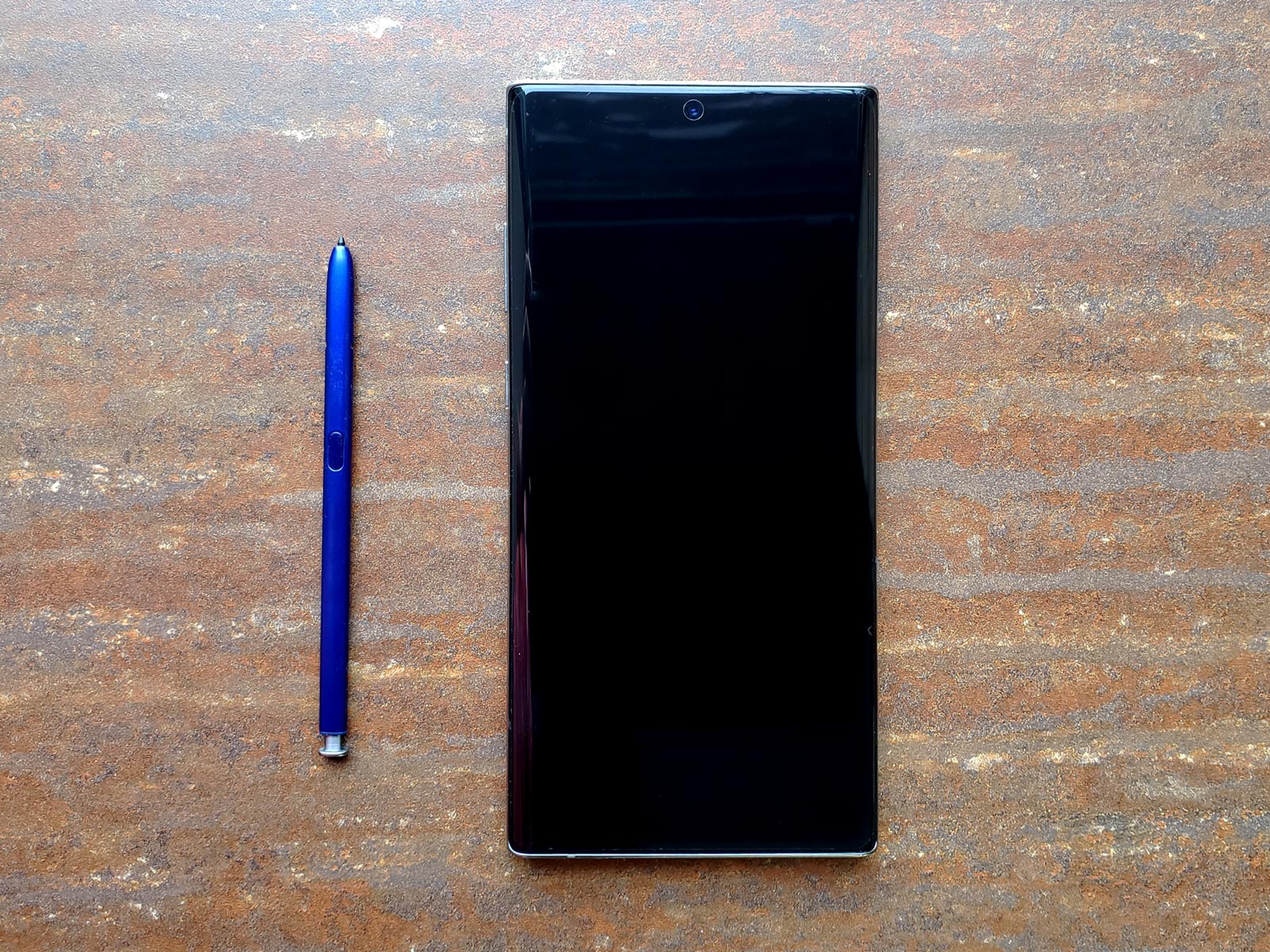

The pen does allow magic wand gestures in a limited amount of apps (mostly Samsung's at this point as other apps have been slow to adopt). I tested it in the gallery app, which could be useful for presentations and also the camera app, which can be used to take photos at a distance.
The Camera(s)
The thing I'll miss most about this test device is the three cameras. On top of your standard camera, there is a wide angle lens and a zoom lens. I found the flexibility of these lenses to be quite endearing, which I tested while shooting a few cyclocross races. Shots can be made more dynamic with the wide-angle lens, and being able to shoot across the way with the zoom lens was incredibly helpful.


The camera software also provides the ability to zoom between each camera effortlessly, though it's not perfectly smooth; there is a slight stutter when each lens is activated. Not a great bug for professional use, but it's certainly easy to appreciate despite the flaw.
It wasn't until far too late that I discovered you can film in ultra HD video (3840×2160) on both the front and rear facing cameras (oh, the pixels I missed!).
Additionally, as I was doing a factory reset to return the device it asked to do an update which boasted "improve the camera picture quality," so a good thing may be getting better.
Subtract one button
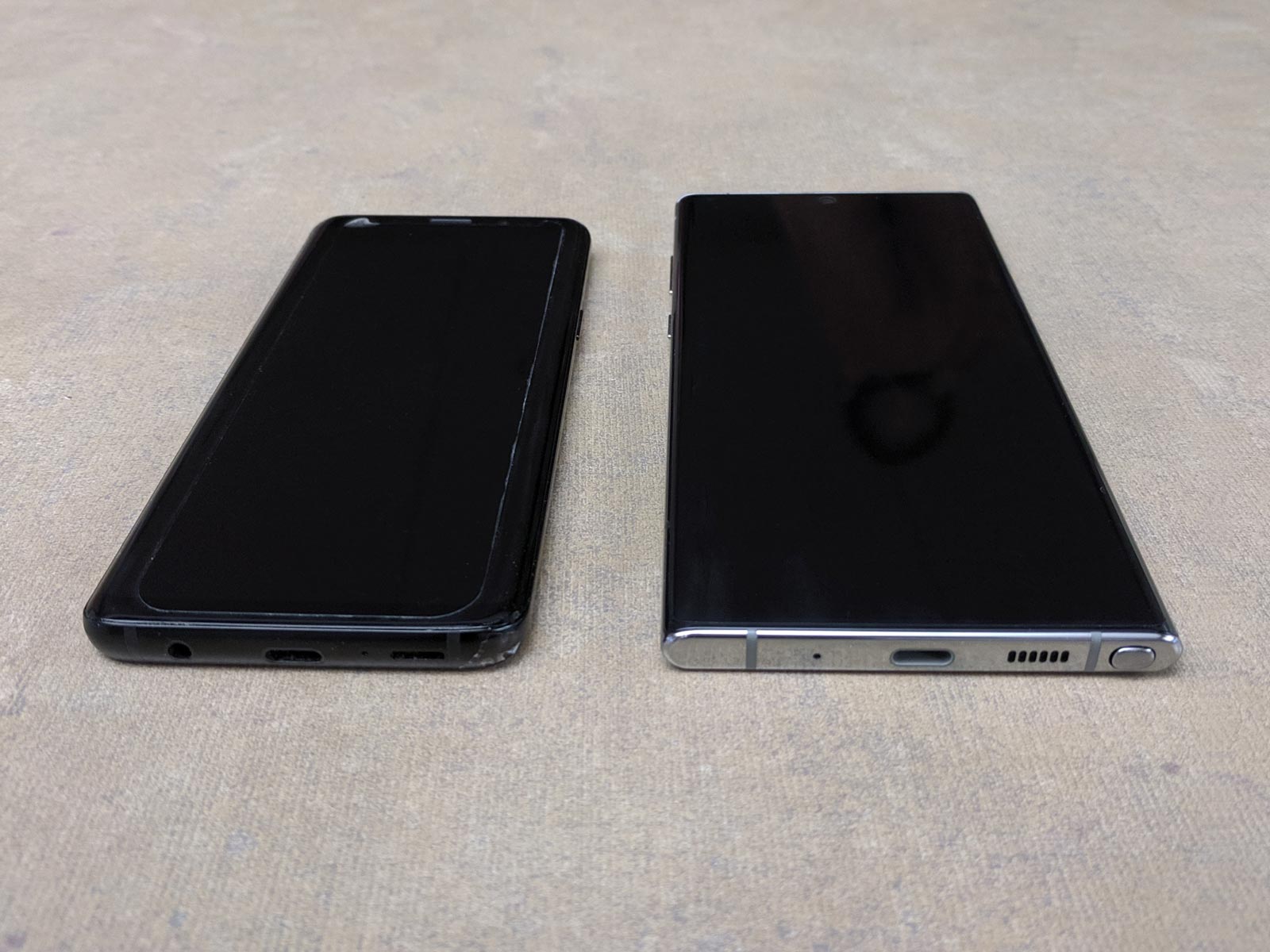
The Note 10+ has thankfully compromised on the most annoying design flaw of the Galaxy S9. The S9 has a physical button dedicated to launching Bixby (Samsung's personal assistant) on the left and the lock button on the right. Thanks to poor positioning, while trying to take landscape photographs I am often either activating Bixby or locking the phone instead of taking a picture (via the volume buttons). This had me backing out of apps and re-opening the camera and by the time I got back to the shot I'd already missed it. Incredibly frustrating.
The Note 10+ thankfully integrates the Bixby button into the lock button (short press to lock, long press for Bixby, double-press to quick launch the camera) and locates all buttons on the left side of the phone. That little change greatly increased my chances of getting a successful picture.
So do I use Bixby now that it's less in the way? Not really. I've never found the voice assistants to be useful in any meaningful way. Even the best ones always seem to be wrong more often than not and bring up more questions than provide solutions.
Bixby Routines
One useful Bixby feature I did appreciate was Bixby Routines which doesn't require talking to your imaginary friend, and which allows users to customize settings based on their needs throughout the day.
The most useful pre-defined customizations is likely to be the bedtime routine, which runs in the evening and reduces blue light, dims the screen and increase battery life through the night by sleeping some apps.
There are lots of settings you can fiddle with in order to optimize your phone throughout your week. One of their clever suggestions in their pre-defined "work" routine was to automatically change sound mode to vibration, to avoid annoying your co-workers.
Front-facing fingerprint reader
2016's Galaxy S7 had a fingerprint reader on the front, but by the time the S9 arrived Samsung had moved the thumbprint reader to the back to make the screen bigger. Having the reader in the back means constantly picking up the phone to use it, or sometimes removing it from a case/tripod if it's blocking the sensor. One solution is to use the facial recognition technology to unlock, but I don't yet trust the security quality on this.
Even though the Galaxy Note 10+ is bigger than the S9, they still managed to move the thumbprint reader back to the front, and it works underneath the display. This is a very nice advancement. Sometimes the sensor is hard to locate when the screen is off because there is no specific pad for your finger; you just have to guess at the approximate location and hope for the best. When the screen is on or when it's contextually necessary, a fingerprint icon appears to indicate finger placement.
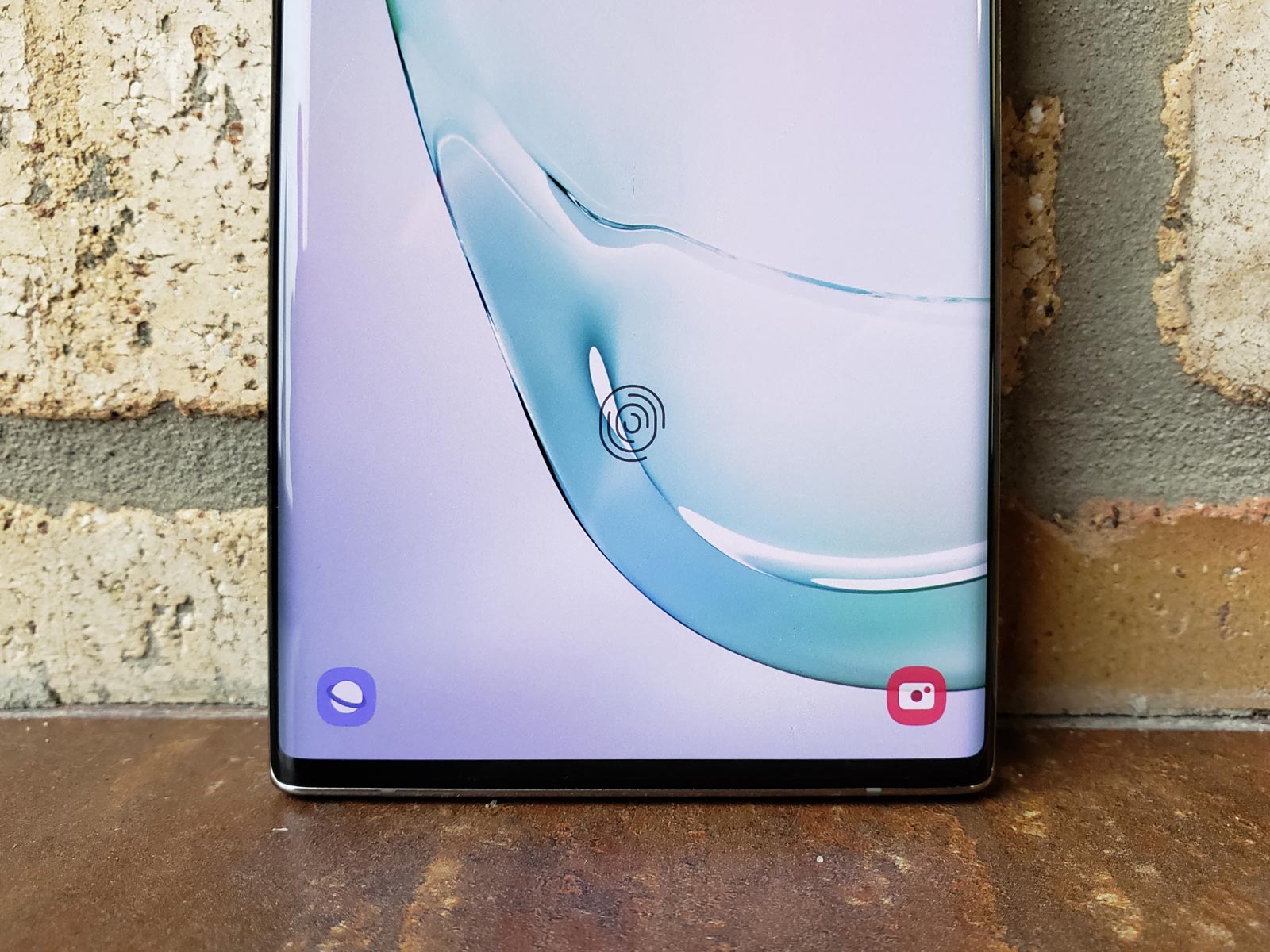
This convenience feature is one of the features I wish I could transfer back onto my own device immediately.
No expandable memory
The Galaxy Note 10+ doesn't come with an expandable memory drawer, which is something I've always looked for, but the two big benefits of expandable memory is starting with a less expensive device (and buying more space as you acquire the funds) and to trade out cards (say a card with different music or movies). Over the last four years, I have found I don't really take advantage of either. I offload medai to my computer with regularity and once I pop in a card, it stays in there.
The Note 10+ comes with 256GB (which I've never come close to using), or you can shoot for the moon with 512GB, which seems like that will feel quite spacious, even 4 years from now.
No 2.5mm headphone jack (but you can use USB-C headphones)
The 2.5mm headphone jack is clearly declining in popularity (at least among manufacturers), but to help nudge you down the path, Samsung does include a set of decent USB-C earbuds in the box. While they are better than the disappointing earbuds that came with the Galaxy S9 (by a long ways), they aren't the greatest on the low end. I'd suggest they're pretty good for outdoor use, but not in quieter settings, like an open-concept office.
If you want to charge your device, you'll either have to get an adapter that allows you to connect both, or use a wireless charger.
The final word
The Galaxy Note 10+ packs in a lot of advanced features, many of which I'll miss as I hand back the review device and go back to my Galaxy S9. The device should appeal to those with artistic endeavors as well as those with office presentations. While it's on the pricier side, it's probably still going to be a worthwhile investment; it's a beautiful and future-forward device, that you could easily hold on to beyond the standard 2-year upgrade cycle.
Jason McDowell grew up in central Iowa and moved to Milwaukee in 2000 to attend the Milwaukee Institute of Art and Design.
In 2006 he began working with OnMilwaukee as an advertising designer, but has since taken on a variety of rolls as the Creative Director, tackling all kinds of design problems, from digital to print, advertising to branding, icons to programming.
In 2016 he picked up the 414 Digital Star of the Year award.
Most other times he can be found racing bicycles, playing board games, or petting dogs.


